The Quest for Perfection in Web Design: An In-Depth Analysis of 12 B2B AI SaaS Companies
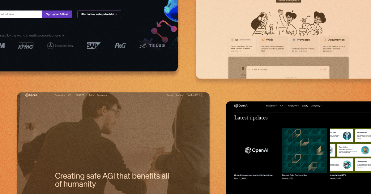
AI is still all the buzz in B2B SaaS, and we don’t see that changing anytime soon. Companies are finding ways to integrate AI into their platforms and have quickly pivoted. New AI startups are sprouting up all the time.
The downside to this quick pivot is that sometimes websites reflect the rush.
At Airfleet, we strive for perfection and obsess over the buyer journey. In our opinion, the perfect homepage is a dynamic webpage that constantly evolves – adapting to the characteristics of a company, including its stage, size, product status, market reach, and the ever-evolving industry landscape.
This means that we expect AI companies to evaluate and establish an ideal customer profile, thoughtfully refine their messaging to tell a compelling story, and embrace design choices that reflect the cutting-edge status of their products and services.
Because website design isn’t a one-size-fits-all proposition, we’ve assessed 12 different B2B AI companies to articulate what the ideal should look like. Eight are a similar stage, size, and location. We’ve included four established companies as a comparison point.
Read on to see how these B2B AI SaaS companies ranked against the ideal.
How did we evaluate the pages?
Our design experts analyzed each website and provided an overall score, write-up, and how each company’s website performed across 5 consistent dimensions.
We scored each website on a quick visual scale from “not great” to “excellent” using the standard emoticons embraced by customer service surveys:
😠 😕 😐 🙂 😀
To ensure we’re judging each company by the same standards, our experts analyzed them across five dimensions. They provided a quick positive (👍), negative(👎), or neutral (🫳) score next to a summary.
The dimensions are as follows:
- Messaging: Is the language concise? Is it clear which personas they serve, what problems they solve, and how they solve them? Do they present clear calls to action?
- User journey: Is the homepage structured logically? Are the next steps clearly articulated? Does the buyer have the information they need to make a decision?
- Design: Does anything catch our eye? Is the design responsive and appealing?
- SEO: Is the website optimized for search engine optimization? How does the website rank for relevant keywords on Google’s first page, and how does it rank against competitors?
- Page Load Score: A website score that assesses traffic by source, speed to load, and responsiveness to different device types and sizes.
These elements alone aren’t enough to build the perfect website, but it’s a great start.
The Assessment: 12 B2B AI SaaS Homepages
Without further ado, here are our top 12 growth-stage B2B AI companies.
- Glean
- Cresta
- Dustt
- Tavus
- Veed.io
- Sourcegraph
- Yokoy.io
- Gladia
- Gong
- GitHub
- Notion
- Open.AI
1. Glean
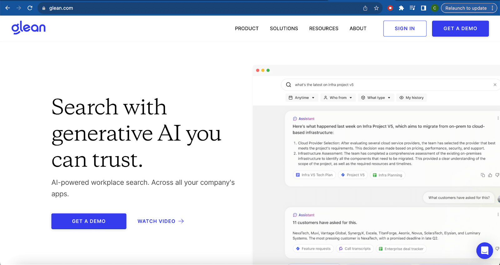
Glean enables businesses to use an AI-powered search across all of their applications. Glean trains on your company’s unique language and knowledge to help your employees be more productive.
The Score
😐
The Write-up
What we liked:
- Concise messaging with solid customer evidence. It’s clear Glean knows its audience and understands how they solve their problems.
- Refined, sleek design with clear CTAs. Bold color choices with good contrast.
- They lead with the product – what it does and how it works. The content is focused on the right elements, keeping pages short and to the point.
- The navigation is organized in a very logical way, giving them a good foundation to build on.
What we think can be improved:
- There are a lot of animated elements that are crammed with content. They often don’t add enough value or clarity to balance out the distraction. We recommend showing less in the animations and reducing how often they are used.
- CTAs direct people to forms with many fields. At the bare minimum, consider reducing the fields. A more ideal solution would be a chat-based calendar experience or an embedded calendar to reduce friction. Also, consider presenting demo video options on the form page.
- The page speed is below industry standard and best practices should be followed – such as compressing elements – to improve performance.
The 5 Dimenions
- Messaging: 🫳 It’s clear Glean knows their target audience and their taglines and descriptions get right to the point. We also see a lot of great social evidence, beginning with their customer logos. However, a lot of the text is either in conflict with or doesn’t match some of the illustration and animation choices.
- User journey: 👎 The main CTAs drive visitors to a long form. The navigation is minimal, which isn’t necessarily a good thing. We would also rethink the animations.
- Design: 🫳 Overall, the design is sleek and refined. The animation is too busy for our taste, distracting from the problems the product solves.
- SEO: 👍 Glean ranks for 112 keywords. It’s a good start with solid foundational content hinting at more to come.
- Page Load Score: 48. 👎 Glean is in a cutting-edge market, and its digital presence should reflect it.
2. Cresta
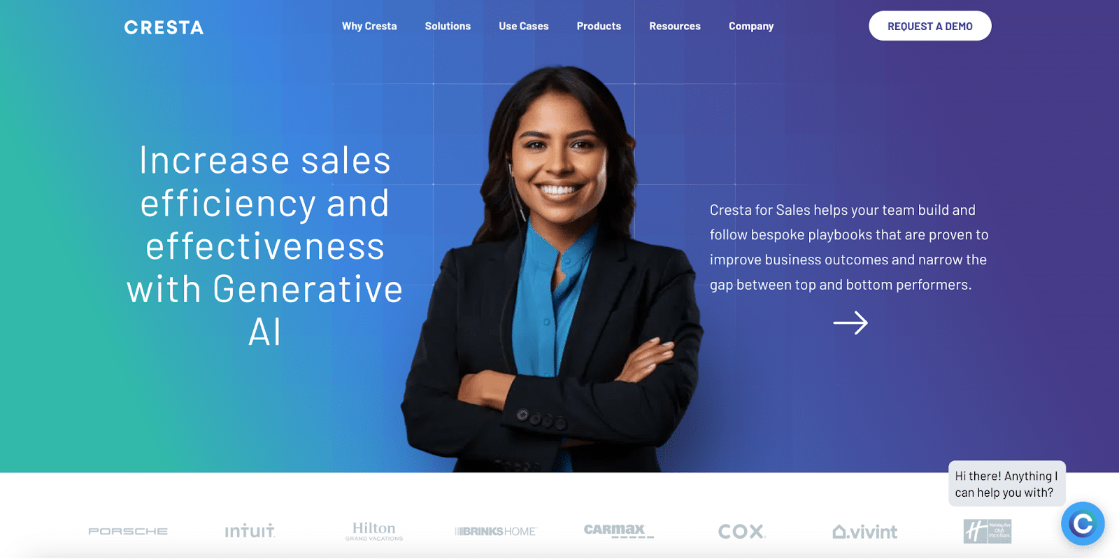
Cresta is a generative AI-powered call center solution that helps businesses identify opportunities for coaching across multiple departments and use cases. It also identifies areas ripe for automation, such as repetitive responses to common questions and post-call quality assessments.
The Score
😐
The Write-Up
What we liked:
- Strong social proof is consistently and effectively integrated throughout the website.
- The content that is on the website is rich and useful.
- Chatbots are effective, and the ROI calculator was a great addition to support customers trying to justify their purchase.
What we think can be improved:
- The hero section needs attention. We weren’t thrilled with the stock image choice, the text needs to have a clearer link between the value statement and how Cresta does it, and the CTA arrow is very weak. Consider clarifying the message and using buttons with a clear label to help visitors understand where they’re navigating to next.
- Several benefit statements are sprinkled throughout the website, such as “boost customer satisfaction and productivity.” These statements aren’t enough to convince people to take a risk in a soft market with skeptical buyers. Instead, focus on how Cresta solves the problem or give a real example of a customer outcome.
- Design inconsistencies between the home page and demo page make it seem like we’re navigating to a new website. It’s a mistake to omit the navigation menu and remove the chatbot on the demo page. This is also a missed opportunity to present p
otential buyers with different ways to see the product in action, like a demo video or product tour.
The 5 Dimensions
- Messaging: 🫳 Cresta uses concise language and very effectively disperses customer evidence throughout their website. It did take a bit of scrolling and poking around the navigation to figure out exactly what Cresta does and who they serve.
- User journey: 🫳 At minimum, we would recommend requiring less information on the demo request form and consider moving to a chat element or integrated calendar feature to remove friction from the experience.
- Design: 🫳 We recommend changing the product carousel to a tabbed element to make it a bit more intuitive. CTA design should abandon the arrows and embrace buttons with a clear explanation of where the person is navigating next. We also would recommend rethinking the fonts to a more legible choice.
- SEO: 👎 Cresta ranks for 50 keywords. Content and SEO build-out should be a priority.
- Page Load Score: 66. 🫳
3. Dust
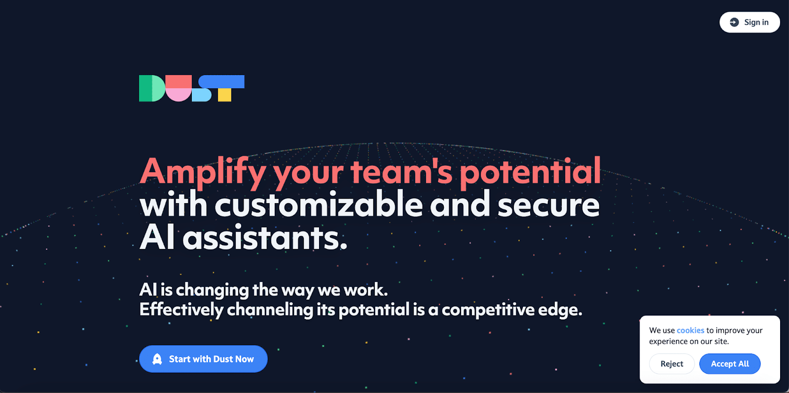
Dust is an AI-powered assistant that integrates with your company’s core applications, monitors end-user behavior, and suggests content and automation to make your workforce more productive.
The Score
😕
The Write-Up
What we liked:
- Dust has a very interesting and eye-catching design, and the product illustrations are particularly impactful. It’s clear what they do and how they integrate with core business tools.
- The messaging is clear but a bit robotic. It reads like generative AI came up with the copy, and it’s a bit off-putting. It would benefit from some human oversight.
- The CTAs are clear, we like the product-led growth jump straight into the product (although it will limit their customer base), and appreciate the transparent pricing.
What we think can be improved:
- Where’s the navigation?
- The animation is a bit frenetic, distracting us from the more important things like what the company does and who they help.
- There’s a lot of empty space in the hero section, and the very long homepage feels like it should be broken up into different pages so things are easier to find.
- Dust feels like an immature company because it’s missing testimonials, next steps for enterprise buyers (they are very unlikely to just create a login), and an ‘About Us’ page.
The 5 Dimensions
- Messaging: 🫳 Dust has a no-frills approach to messaging that we appreciate, although it reads like generative AI produced the content – and would benefit from a skilled marketer’s touch.
- User journey: 🫳 Some risky design choices paid off, and others didn’t.
- Design: 👎 Overall, the design is interesting and eye-catching. The background animation is too much. Where’s the navigation?
- SEO: 👎 Dust ranks for 15 keywords.
- Page Load Score: 61. 🫳
4. Tavus
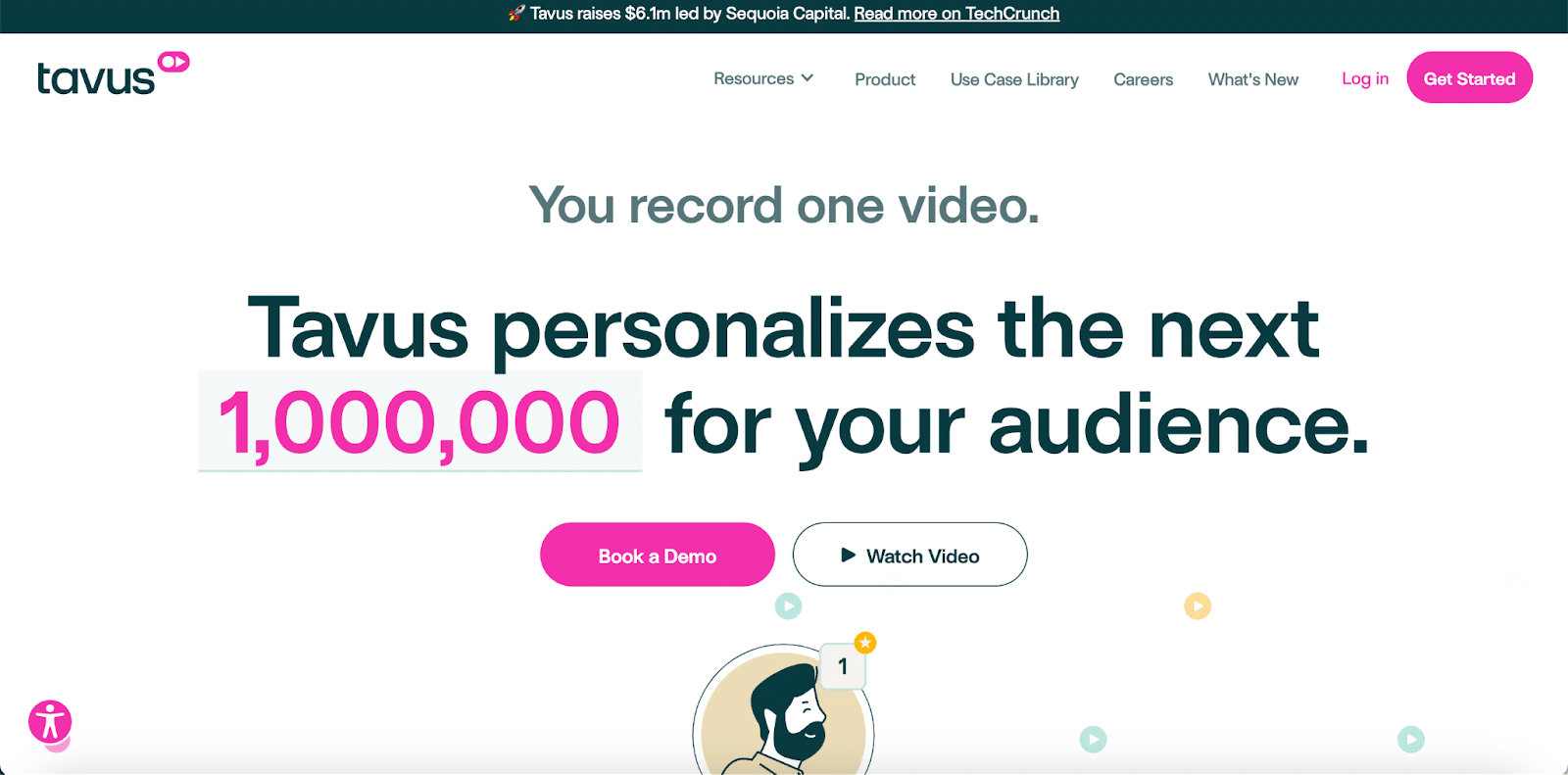
Tavus uses AI to personalize videos seamlessly so your sales team and support organization can scale their communication effectively.
The Score
🙂
The Write-Up
What we liked:
- We liked the joyful design and color palette.
- Compliments on the amazing social proof with a comprehensive use case library.
- We like that Tavus leads by showcasing what the product does over vague benefit statements. We especially find the actual product demo video compelling.
- A solid representation of what a demo page should look like, including an effective use of calendar integration.
What we think can be improved:
- Some of the design choices are holding Tavus back. It took us a while to figure out what Tavus does because the first heading in the hero is almost invisible. The messaging also lacks some clarity. We think using a video showing what the product does or demoing a use case would be far more effective.
- Not all personas will understand what personalization tokens are. We recommend either showing instead of telling with video or introducing more straightforward explanations.
- Change the homepage structure to lead with use cases, put pricing in the main navigation, consider having a product-led signup for earlier-stage companies eager to try the product, and rethink prioritizing illustrations and text over video.
The 5 Dimensions
- Messaging: 🫳 It took us some time to really understand what the product does. Showcasing videos throughout the website would align more with what the product does than a text-based message with an animated, distracting illustration.
- User journey: 👍 The Tavus website does an excellent job of driving customers to a demo page, and the demo page is well done!
- Design: 🫳 For a company that offers a video product, Tavus is missing out on an opportunity to show instead of tell and create a more engaging customer experience.
- SEO: 👎 Tavus ranks for 13 keywords.
- Page Load Score: 86. 👍
5. Veed
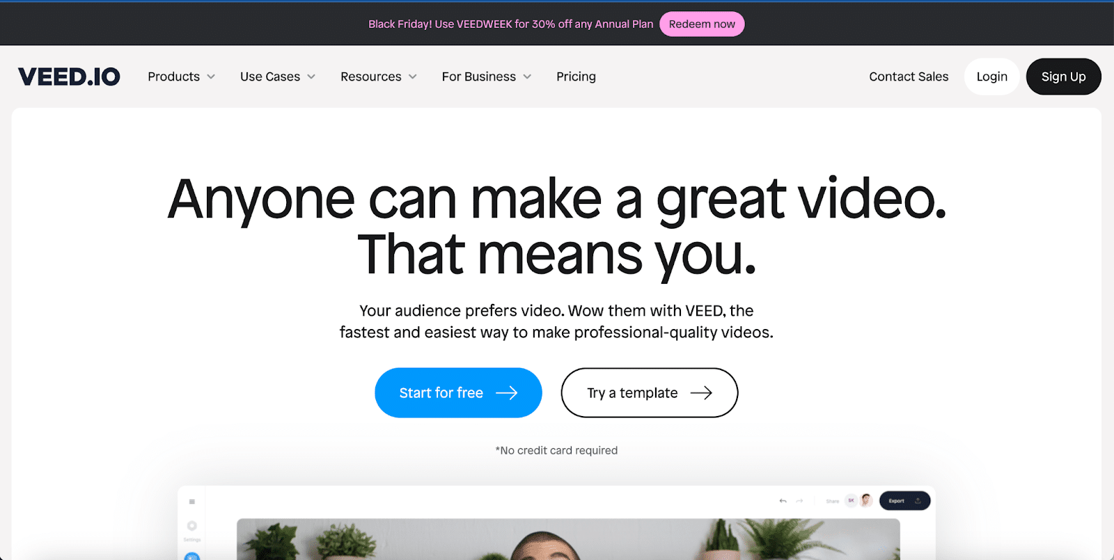
Veed offers an AI video generator and automated video editing to help companies save time and look more professional. Their video editing tool also allows companies to easily add captions and advanced encoding.
The Score
😐
The Write-Up
What we liked:
- The PLG play is excellent. Letting users start with the product is always the best way to go if done right.
- The CTAs are clear and pop to attention immediately.
- The template library section is engaging and relevant. It’s a great way to get people hooked and use a product feature immediately. Nice job!
- The mega menu makes navigation easy (albeit a bit busy), and Veed’s extensive content has given them impressive keyword volume.
What we think can be improved:
- The messaging leans in the direction of “cute” rather than descriptive. It needs more clarity. We’d recommend focusing messaging on what Veed does for its target buyers. A simple video showing the product in action can be an excellent addition to the hero.
- Commit to a single CTA in the hero. Either start with the template or a “Start Now” CTA.
- The non-PLG path is cumbersome. Consider engaging demo requests in a chat workflow or integrate a calendar with the book demo form to cut down on steps.
- The use cases section isn’t clear – the titles just replace the images. We expect a blurb about each use case once we click the name.
The 5 Dimensions
- Messaging: 🫳 We love no-frills, direct messaging. However, we needed more explanation to understand what exactly Veed does quickly. We wonder if generative AI was leaned on a little too heavily…
- User journey: 🫳 We think users would benefit from more clarity overall, including streamlining the path to a demo.
- Design: 🫳 Since Veed’s product is a video product, leaning on video more would make a lot of sense.
- SEO: 👍 Veed ranks for over 35,000 keywords.
- Page Load Score: 69. 🫳
6. Sourcegraph
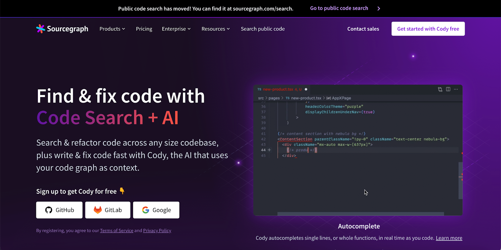
Sourcegraph uses AI to recommend code fixes and write additional code based on your company’s code graph.
The Score
🙂
The Write-Up
What we liked:
- Clear messaging. We quickly understood who Sourcegraph targets and what they do.
- Great CTA with an easy-to-use login via the most popular tools on the market. This is a great example of PLG done well.
- We like the color palette and appreciate how it mirrors the UI of common programming tools and preferences.
- Really nice use of social proof, including the Twitter/X embed.
- The demo page was an excellent collection of best practices. There was a chat prompt to connect with an engineer, auto-complete using Clearbit, and an integrated Chilipiper calendar.
What we think can be improved:
- The product section on the homepage was ordered too early and is very empty compared to the rest of the site. Consider swapping out with solutions or leading with benefits.
- The benefits section should be something other than a carousel.
- The site is a bit boring. The color choices are safe and don’t help Yokoy stand out. The home page could also benefit from more product examples or animation.
- The error messages on the forms are missing, so it’s unclear why it doesn’t allow us to submit the form. For such an important component, this is an inferior user experience.
The 5 Dimensions
- Messaging: 👍 Sourcegraph uses concise, no-frills language to describe what they do quickly.
- User journey: 👍 The demo buyer path is probably the most criticized aspect of B2B SaaS web pages, but Sourcegraph does an excellent job of streamlining the process.
- Design: 👍 The aesthetic is strong and parallels a lot of the tools and preferences we see programmers using. We can see that the design choices were made with their key personas in mind, which is very smart. We recommend avoiding carousels in the hero when possible. The “What Is Sourcegraph” image was an odd choice, and the video in the home page hero appears to be negatively impacting page load time..
- SEO: 🫳 Sourcegraph ranks for 178 keywords. We think the dual domains are negatively impacting SEO and would prioritize implementing SEO best practices.
- Page Load Score: 60. 🫳
7. Yokoy.io
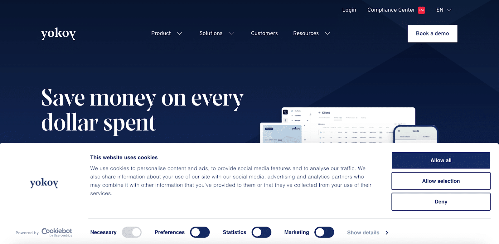
Yokoy is an AI-powered global expense management platform that helps companies automate their workflows.
The Score
😐
The Write-up
What we liked:
- Yokoy has strong social proof, and we like the logos and testimonials they shared.
- Clean design and clear CTAs.
- Because they are in the Finance sector, the compliance labels and popups were a nice addition.
- The ROI Calculator and “Watch a demo” are two components that every company in this list could benefit from mirroring.
What we think can be improved:
- The product section is a bit too early and very empty compared to the rest of the site. Consider swapping out with solutions or leading with benefits.
- The benefits section shouldn’t be a carousel.
- The site is a bit boring. The color choices are safe and don’t help Yokoy stand out. The home page could also benefit from more product examples or animation.
- The error messages on the forms are missing, so it’s not clear why it doesn’t allow us to submit the form. For such an important component, this is a very poor user experience.
The 5 Dimensions
- Messaging: 👍 Yokoy concisely communicates what they do and who they serve.
- User journey: 👎 There are a lot of problems with the demo form. There aren’t any error messages, so it’s very unclear why it doesn’t let a user submit the form if there’s a problem. This is a very negative user experience.
- Design: 🫳 The design is clean, but the color choices are not memorable. Even in the finance sector, a website can benefit from personality.
- SEO: 👎 Yokoy ranks for 42 keywords. Look for opportunities to reuse videos and transcripts to build out content and prioritize creating more content that’s relevant to the product and provides value to their audience.
- Page Load Score: 88. 👍
8. Gladia
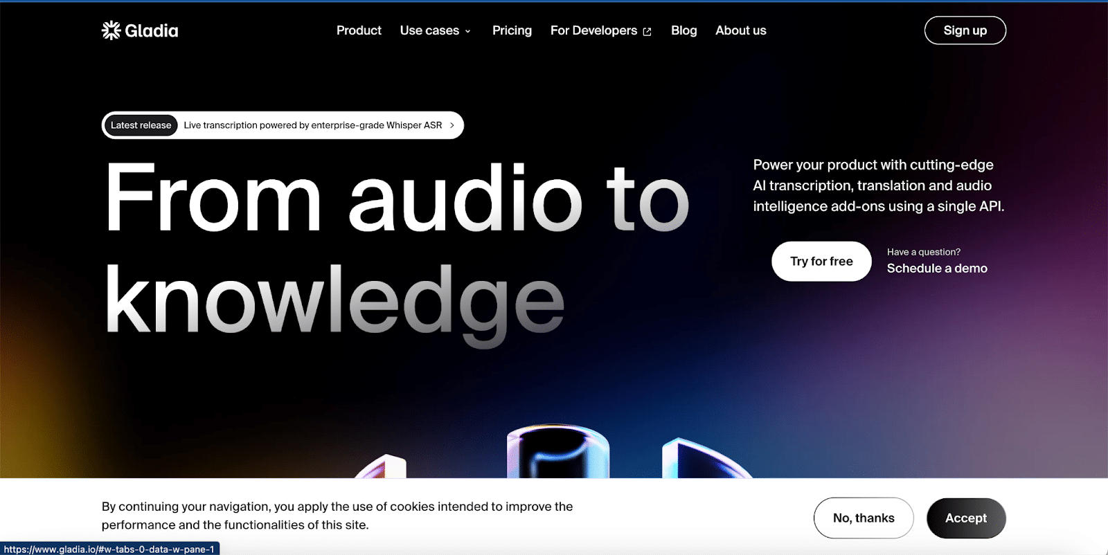
Gladia uses AI to transcribe, translate, and analyze your audio. Their use cases span virtual meetings, call centers, and content media.
The Score
😐
The Write-Up
What we liked:
- Big, in-your-face typography and sections.
- Using Typeform instead of a standard form for contacting sales was a great design choice and very intuitive.
- The features highlighted in the API section were powerful and clear.
- We think Gladia’s prospects will appreciate the clear pricing page and R.O.I. calculator.
What we think can be improved:
- Because the hero section font choices are so bold, the CTAs are a bit hidden because of the contrast.
- We recommend embedding Typeform on the CTA page for better analytics and to make the journey seamless.
- There’s too much reliance on buzzwords, and the home page seems disjointed with a switch in focus to product integration from an end-user point solution. What Gladia does needs to be more explicit.
- We recommend prioritizing content and adding more social proof – testimonials or case studies – wherever possible to help with keywords and credibility.
The 5 Dimensions
- Messaging: 👎 Gladia leans too much on buzzwords, and there seems to be some internal conflict over what go-to-market strategy should take priority.
- User journey: 🫳 The clear pricing page and calculator are fantastic. Typeform instead of a form for contacting sales is great and intuitive. We recommend adding use cases and more clarity into which solutions fit into which scenarios to make the buyer journeys more intuitive.
- Design: 🫳 Some areas shine more than others.
- SEO: 👎 Gladia ranks for four keywords. Prioritizing content is a must.
- Page Load Score: 74. 👍
9. Gong
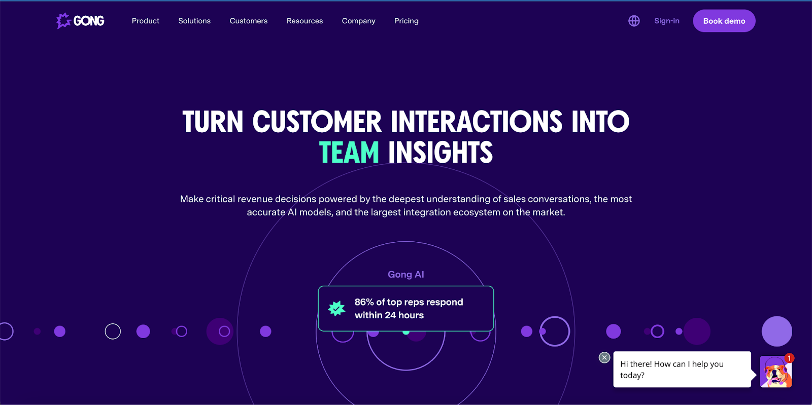
Gong is a conversation intelligence platform that helps companies understand their competitive landscape, assess customer attitudes, and quickly analyze product feedback.
The Score
😀
The Write-Up
What we liked:
- Gong does a great job of making the most of Drift playbooks.
- The messaging is clear, and the bold design and colors are well-recognized in the industry.
- Using popups directly from the top fold for different navigation options was a unique choice that paid off.
- Properly done social proof, including review site features from Gartner Peer Reviews, G2, and TrustRadius.
What we think can be improved:
- We were surprised at the lack of use cases and resources linked on the homepage. Gong has excellent content – making this a noticeable missed opportunity.
- The poor page speed is noticeable and well below industry standard.
- The demo page is a bit less inviting than the rest of the site. While we appreciate the short form, it’s not very noticeable.
The 5 Dimensions
- Messaging: 👍 It’s clear Gong has figured out its identity and can communicate it flawlessly.
- User journey: 👍 The demo page isn’t as inviting as the rest of the site, but the form is short. We like how Drift playbooks were leveraged, the integration with Chilipiper to simplify scheduling meetings, and the clear CTAs.
- Design: 👍 The bold choice of colors has helped Gong stand out in the market. The use of popups in the top fold for navigation was effective, we liked the reviews feature, and found the navigation to be one of the best in this cohort.
- SEO: 👍 Gong ranks for 2,111 keywords.
- Page Load Score: 42. 👎 Performance improvement should be their top priority.
10. Github
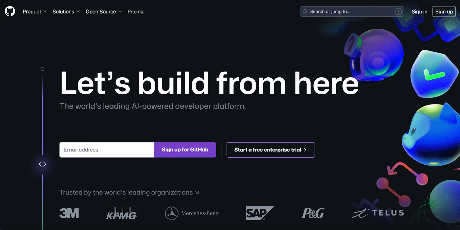
Github’s AI-powered developer platform helps businesses build, scale, and deliver secure software.
The Score
😀
The Write-up
What we liked:
- An amazing and unique visual concept with colors that pop. The text is very readable, and the animations aren’t too much. The neon colors and dark mode are wise choices to appeal to their personas.
- The messaging is only clear for people who know Github. Because they’re so established in the market, it works.
- Clear, simple CTA using email. We wonder if they get many clicks on the “Start a free enterprise trial”?
- Fantastic social proof with the biggest enterprise logos out there.
- Their homepage is very set on explaining “Productivity, Collaboration and Security,” so changing the navigation on scroll is an interesting move.
- Amazing screenshots and illustrations of the product
What we think could be improved:
- They focus on benefits versus how they solve a problem. Because the market knows them, this isn’t as much of an issue – but a smaller company couldn’t get away with this approach.
- The fact that the menu is organized in a different order than the page is a bit weird and creates confusion when using the sub-navigation.
- There isn’t a lot of clarity about the features – only short blurbs and images. A greater focus on features and capabilities would be a better choice here.
- Assuming that the main driver of implementing a Git provider in an organization is the R&D team, the security features shouldn’t be a primary focus on the homepage.
The 5 Dimensions
- Messaging: 🫳 Normally, we wouldn’t give a company that vaguely describes its product a neutral rating, but Github is so well-established that they can get away with some ambiguity.
- User journey: 👍 The CTAs are simple.
- Design: 👍 We think the color choices and fonts are great, but we find the clashing navigation and page layouts distracting.
- SEO: 👍 Github ranks for 854,335 keywords.
- Page Load Score: 79. 👍
11. Notion
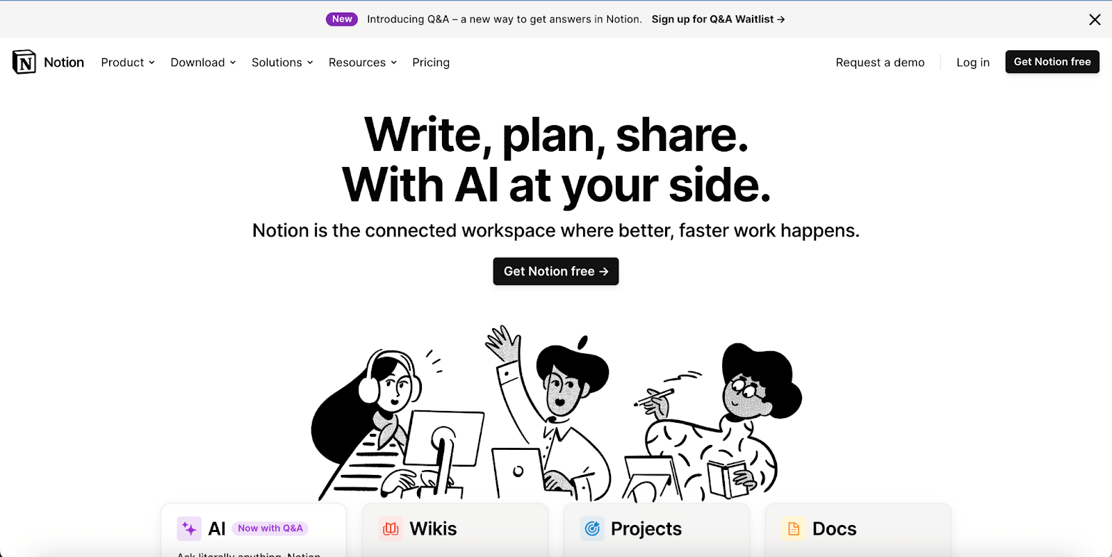
Notion is an online collaborative workspace that helps employees organize, create, and share knowledge.
The Score
🙂
The Write-Up
What we liked:
- A good distribution of use cases by business units and strong templates and examples.
- Great navigation with a simple mega menu elaborating the features and use cases.
- Amazing use of social proof that’s done in a way to reduce visual clutter or crowded elements.
- Clear pricing, besides slapping the AI feature as an add-on. It’s unclear why this would double the price.
- Hidden in their footer is a comparison vs alternative section. When we dug deeper, Notion has 21 (amazing!) comparison pages, which are excellent for capturing high-intent searches.
What we think can be improved:
- We remember the previous messaging Notion used on their website, and we miss it. The new emphasis on AI seems rushed, and the value isn’t strongly communicated, giving the impression that they are trying to keep up with the market rather than taking a user-driven approach.
- Putting a download option as a second choice in the navigation is an odd choice.
- The section design is cramped in a small container, which doesn’t translate well to a desktop or large screen. Pay attention to how the majority of visitors access your site and prioritize your design accordingly to avoid wasted space.
The 5 Dimensions
- Messaging: 👍 The explanation of Notion’s features was very clear, and we liked that they used screenshots that were very easy to understand. However, we feel the new AI add-ons feel rushed and disjointed.
- User journey: 🫳 There’s a well-designed product-led user journey to start the signup process. Clear CTAs across the site emphasize the product and features with small links for other supporting materials. The enterprise buyer journey is nearly non-existent.
- Design: 🫳 The design mirrors the product and is very intuitive. The sparing use of colors is excellent, but Notion may need to rethink the cartoony look and feel if they want to acquire more enterprise logos.
- SEO: 👍 Notion ranks for 14,871 keywords.
- Page Load Score: 65. 🫳
12. Open.AI
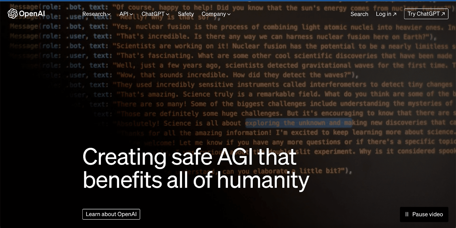
OpenAI drove the generative AI revolution to a fever pitch in 2023. Their products include a free version that is a shared environment used to train their algorithm and expand “answer” results.” They also have private environments for purchase that allow users to upload data and keep generated text more secure. OpenAI has been in the news for a succession-like takeover of the CEO position and has shifted its messaging to its new mission to spearhead AI ethics and safety.
The Score
🙂
The Write-Up
What we liked:
- They are a known brand after launching ChatGPT, and they are still heavily leaning into vision versus demonstrating deliverables. Because they are so well known, it works.
- Slick, clean design with very readable colors and font. The limited usage of colors in resources and images was a great choice.
- Clear and straightforward pricing.
- The product video on the Dall-e-3 page is excellent, so we think it should be used in the hero instead of the “research” CTA.
What we thought could be improved:
- The website is geared towards investors, press, and AI technology researchers and not towards customers. It’s an odd choice for a for-profit company with such a strong brand.
- The images are cohesive with the overall design, but, oddly, they provide no value besides focusing on humans, even though the company is focused on computers and technology.
- The website can be very confusing for people who have never heard of ChatGPT (if these people exist at this point?). If their ICP is a company looking to integrate OpenAI models, they make it very difficult to get to the actual product page (which is under API). We recommend overhauling the navigation.
- They have an active blog but don’t provide a way to subscribe to it. The blog is also nested under “Company” for some reason.
- Usually, we would expect companies to have some social proof. They may not need it. People are signing up regardless.
- Performance isn’t great (45), probably due to the big hero video.
The 5 Dimensions
- Messaging: 🫳 They seem to be having a bit of an identity crisis. Their website is focused more on acquiring investors than serving customers.
- User journey: 👍 As long as you already know what OpenAI does, it’s very simple to follow their product-led signup process.
- Design: 🫳 We found the design eclectic and lacking a focal point for buyers.
- SEO: 👍 OpenAI ranks for 36,570 keywords.
- Page Load Score: 45. 👎
Our key takeaways from evaluating B2B AI SaaS websites
There are endless possibilities for creating an appealing and converting homepage, but the fundamentals will always hold true:
- Identify your ideal customers.
- Know what matters to them.
- Showcase your unique selling points in a manner that demands their attention.
According to Forrester, 90% of the buyer journey is complete before a customer ever reaches out to a salesperson. In a market with buyers who prefer to interact with digital resources over speaking to humans, it is more critical than ever that companies prioritize digital marketing early in their development.
Unfortunately, we’re not seeing indicators that B2B SaaS companies are adapting to their buyer’s preferences.
This behavior must change, especially for companies trying to stay on the cutting edge of innovation to gain market share. Take the time to polish and perfect your website. It’s your prospect’s first experience with the brand, and getting your website right is mission-critical.
Like with any product, your messaging should focus on why your customers should care about your product, demonstrate a deep understanding of their pain points, show them an elegant solution, and then always back it up with plenty of customer evidence.
If you’re looking to transform your homepage into a revenue-generating one, let’s talk.
Not every website needs a rebuild. Yours might.
Before committing to a costly redesign, get clarity. Our assessment gives you an honest, data-backed view of what’s broken, what’s salvageable, and what to do next.
