


The Quest for Perfection in Web Design: An In-Depth Analysis of 10 Cybersecurity Webpages
At Airfleet, we’re a little obsessed with perfection. With a constantly evolving technology landscape and a wide array of tactics to choose from, it’s a never-ending quest.
The perfect homepage is a dynamic webpage that constantly evolves – adapting to the characteristics of a company, including its stage, size, product status, market reach, and the ever-evolving industry landscape.
Because website design isn’t a one-size-fits-all proposition, we adjust our expectations by B2B technology sector and present ten different companies – in a similar industry, stage, size, and location – to articulate what the ideal should look like.
Read on to see how these cybersecurity companies ranked against the ideal.
How did we evaluate the pages?
Our design experts analyzed each website across five dimensions:
- Messaging: Is the language concise? Is it clear which personas they serve, what problems they solve, and how they solve them? Do they present clear calls to action?
- User journey: Is the homepage structured logically? Are the next steps clearly articulated? Does the buyer have the information they need to make a decision?
- Design: Does anything catch our eye? Is the design responsive and appealing?
- SEO: Is the website optimized for search engine optimization? How does the website rank for relevant keywords on Google’s first page, and how does it rank against competitors?
- Page Load Score: A website score that assesses traffic by source, speed to load, and responsiveness to different device types and sizes.
These elements alone aren’t enough to build the perfect website, but it’s a great start.
Marketers know better than anyone that measuring a brand’s effectiveness is difficult, but we feel our experience creating hundreds of B2B technology websites allows us to offer a valuable assessment with clear action items to help these companies take their website from lead magnet to revenue generator.
The Assessment: 10 Cybersecurity Homepages
Without further ado, here are our top 10 growth-stage cybersecurity companies.
- Persona
- Fingerprint
- Sonrai Security
- Judy Security
- Claroty
- Noname
- Sumo Logic
- Drata
- Egnyte
- Vanta
1. Persona
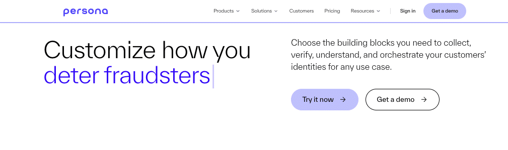
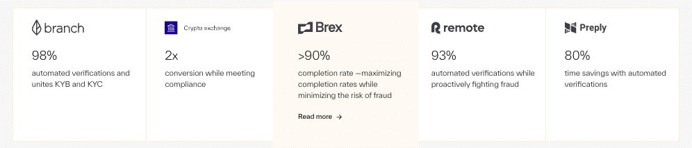
Persona helps businesses collect, manage, and verify personal identifiable information (PII) and further analyze this information to reduce risk, prevent fraud, and automate personalized workflows. Persona helps companies verify more than just form fill data. They help businesses manage KYC/AML/KYB programs, have access to government ID databases, and possess selfie facial recognition, enabling comparisons to user profiles across multiple social media platforms.
The 5 Dimensions
- Messaging: Persona has many features across multiple use cases. Their Solutions navigation item helps indicate who and which industries they are best suited to serve, and the typewriter animation on the home page is a clever (albeit distracting) way to showcase multiple use cases to appeal to a broader audience. However, the benefits or how Persona specifically solves problems could be more clearly articulated. We also think powerful customer evidence with clear return-on-investment statistics should be displayed more prominently. These proof points are in high demand, and Persona would benefit from showcasing them front and center.
- User journey: Their calls to action are clear and in the hero. The tabbed product features and use case elements create a strong narrative and effectively funnel people to high-value pages. However, the multi-level navigation is overwhelming and may not be intuitive to all users.
- Design: This is Persona’s greatest opportunity for improvement. We want to call their attention to the video embed (we found they have an odd aspect ratio that doesn’t fit well on multiple screen dimensions), an array of moving elements, and the multi-click navigation. We encourage thinking through creative solutions to streamline the navigation (less is more!) and reassessing videos for responsiveness.
- SEO: Persona ranks for over 1,284 keywords, which is impressive. Their website structure is well done, including canonical tags, alt tags, headers, and other SEO-related items.
- Page Load Score: 84. Although Persona follows best practices for SEO, performance, and accessibility bring the score down to 84.
TL;DR What we like:
- Clear CTAs in each hero.
- Tabbed product features and use case elements are an effective way to funnel people to high-value pages.
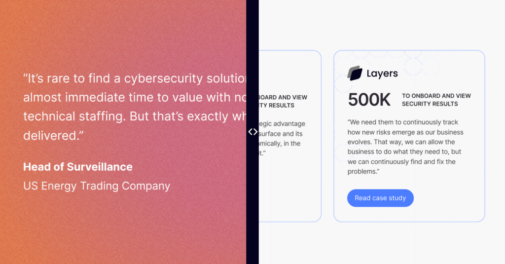
- Excellent case studies are linked on the homepage with clear return-on-investment statistics – and we recommend featuring them a couple of sections higher.
TL;DR What we think can be improved:
- There are too many moving elements above the fold. Pairing a video and a dynamic headline proved to be visually overwhelming.
- Use caution when embedding videos. We found some had an unusual aspect ratio that didn’t lend well to multiple screen dimensions.
- The benefits section (“Tackle your biggest identity challenges, painlessly”) is very flat compared to the rest of the page, both in content and visual style. The “Building Blocks” (product features) should be below the video to help emphasize priority.
2. Fingerprint
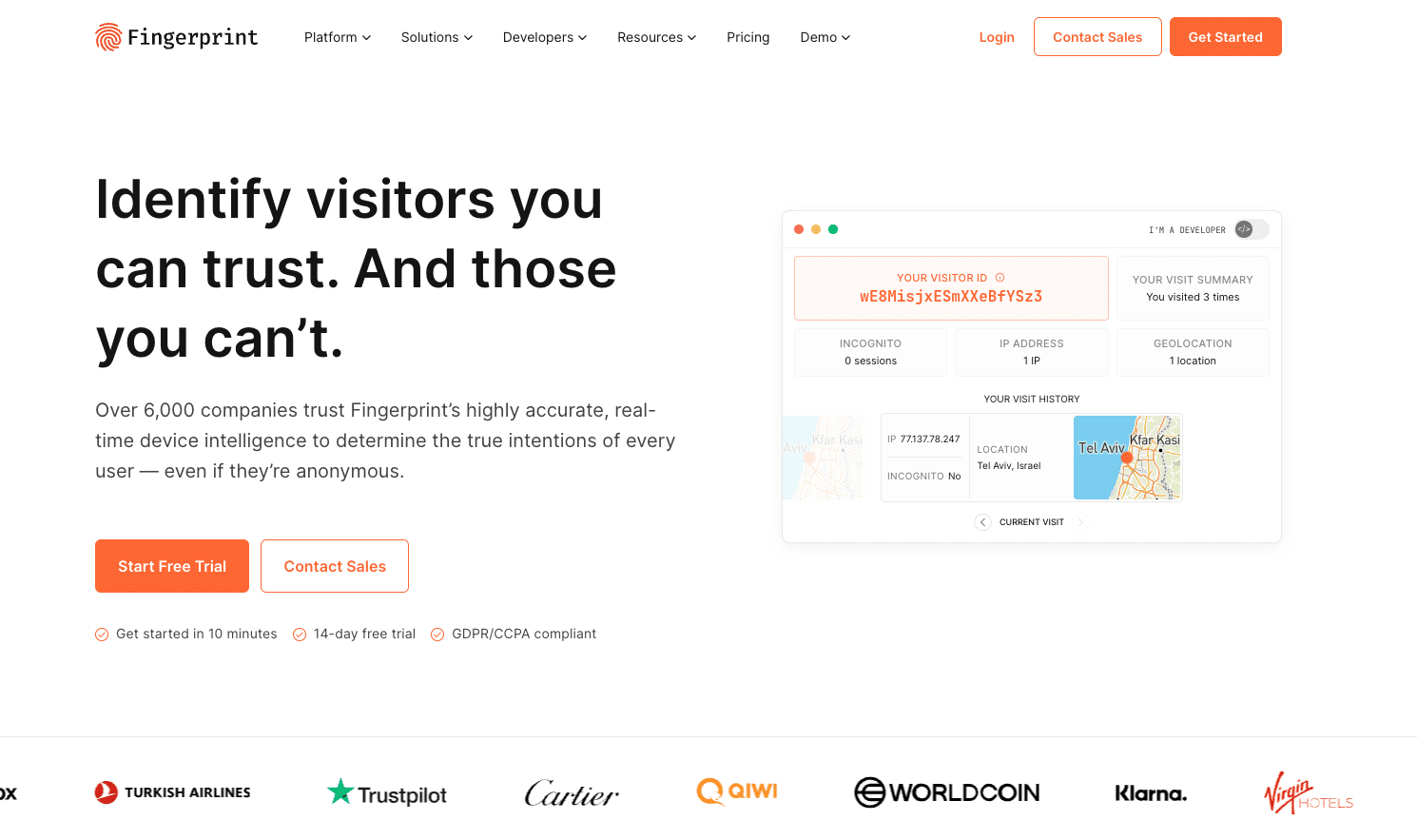
Fingerprint is a device identification tool to help businesses identify users and determine whether their intent is harmless (or not).
The 5 Dimensions
- Messaging: From a content and graphics standpoint, Fingerprint gets an A+. The language is clear and direct. The visuals are not frivolous and add context. We had no problem understanding who they target, what problems they solve, and exactly how those problems are solved. We particularly enjoyed the visitor identification feature because it was an excellent example of “show, don’t tell.” We liked how the website design tangibly integrated their feature.
- User journey: Some mixed visual signals made navigating the website more difficult. While the navigation is clear and CTAs with time to completion flags were a touch of brilliance, several items seem clickable that aren’t (“Use Cases” is an example). We recommend prioritizing featuring customer evidence (use cases, return-on-investment statistics, and testimonials) wherever possible, as this is a priority for today’s buyers.
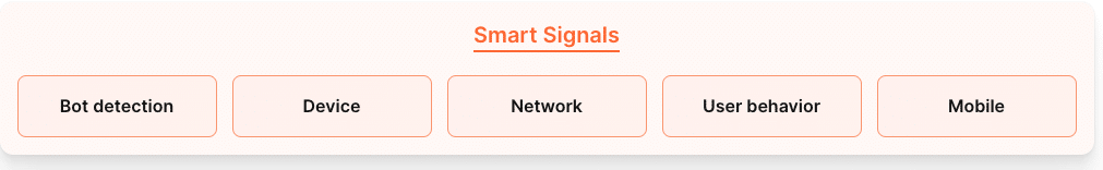
- Design: Fingerprint’s accessibility score was beyond reproach. However, page load times and performance issues must be addressed. We recommend cutting back on some design elements that don’t serve a
clear purpose. For example, there were clickable elements that didn’t do anything of note (for example, “Smart Signals”). While we appreciate clever design, these elements struck us as unnecessary load time. - SEO: Persona ranks for only 321 keywords. The right high-value content could go a long way in attracting more prospects, particularly with a topic gold mine like the deprecation of third-party cookies.
- Page Load Score: 61. Fingerprint follows SEO best practices and gets an A for accessibility, but some design elements are lowering overall performance. The tradeoff isn’t there, and design elements should be used only when there is a clear purpose.
TL;DR What we like:
- The visitor identification element is an amazing example of showing rather than telling. The feature catches the eye and is beautifully executed.
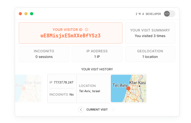
- The whole homepage is clean, crisp, and perfectly finished. This makes the user journey exceptionally clear and effortless.
- Details like the flags under the hero CTAs (“Get started in 10 mins”) add polish and sparkle to the experience.
TL;DR What we think can be improved:
- Some elements that seem clickable are not. Use Cases, for example.
- Some clickable elements don’t do much. For example, the tabs under “Smart Signals”). Design for design’s sake is just a distraction.
- Ideally, there should be links from the homepage to specific case studies and testimonials.
3. Sonrai Security
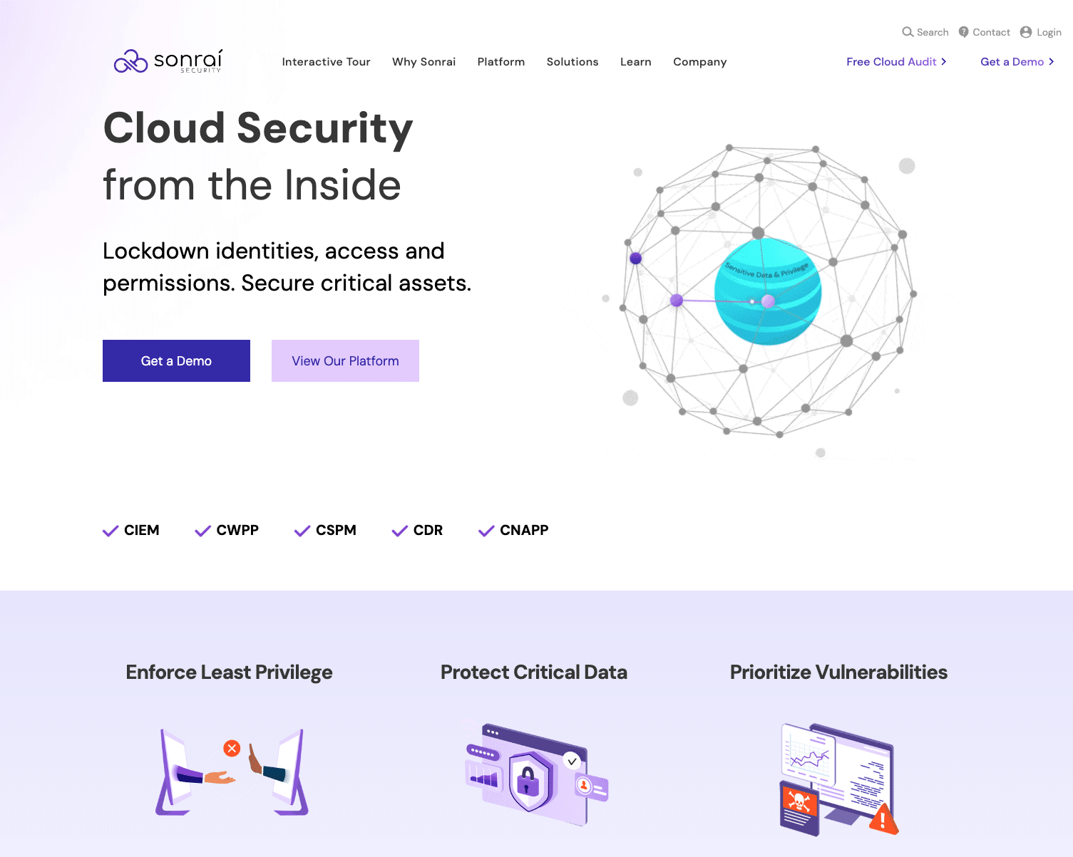
Sonrai Security is a cloud security service for companies running on AWS, Azure, and Google Cloud. Their identity graph allows companies to analyze all identities, activity, and relationships in their enterprise cloud environment.
The 5 Dimensions
- Messaging: At the risk of not winning the next cyber security awarded popularity contest, we found their messaging bogged down by a tendency we often see in B2B: alphabet soup proliferation or overusing initials and acronyms. Simply stating what something does always wins out over overly specific industry terms. There are more concise ways to describe what Sonrai Security does, and their personas would respond better to plain English.
- User journey: We recommend making navigation updates the top priority, especially considering that Sonrai Security is targeting an enterprise audience. The intended path for users is unclear because of cramped and cluttered navigation and inconsistent button sizes. We also see conflicting CTAs between the navigation menu and what is in each page’s hero. The big positive we found was a prominent feature of use cases in all the right places.
- Design: From a visual perspective, Sonrai Security is a mature company with a sleek look. Unfortunately, the navigation and confusing CTAs hinder the aesthetic and buyer experience.
- SEO: Sonrai Security ranks for 222 keywords. We recommend prioritizing high-value content relevant to their infosec audience to help draw in additional relevant traffic.
- Page Load Score: 79. Sonrai Security would benefit from some attention to SEO-specific errors and enhanced accessibility.
TL;DR What we like:
- Attractive and mature visual style.
- Feature & use case sections are solid and clear, with good calls to action.
- Substantial case study featured on the homepage.
- The hero section at the bottom of the page is strong (notably stronger than the top hero).
TL;DR What we think can be improved:
- A lack of polish holds strong design choices back. The navigation feels visually cramped and cluttered. The buttons are visually inconsistent.
- Hero CTAs don’t relate to CTAs in navigation. Too many different calls to action for a brand-new visitor, making for a confusing buyer experience.
- Very jargon and acronym-heavy – even for an infosec audience. We recommend using plain language at the top of the page or considering featuring tooltips.
4. Judy Security
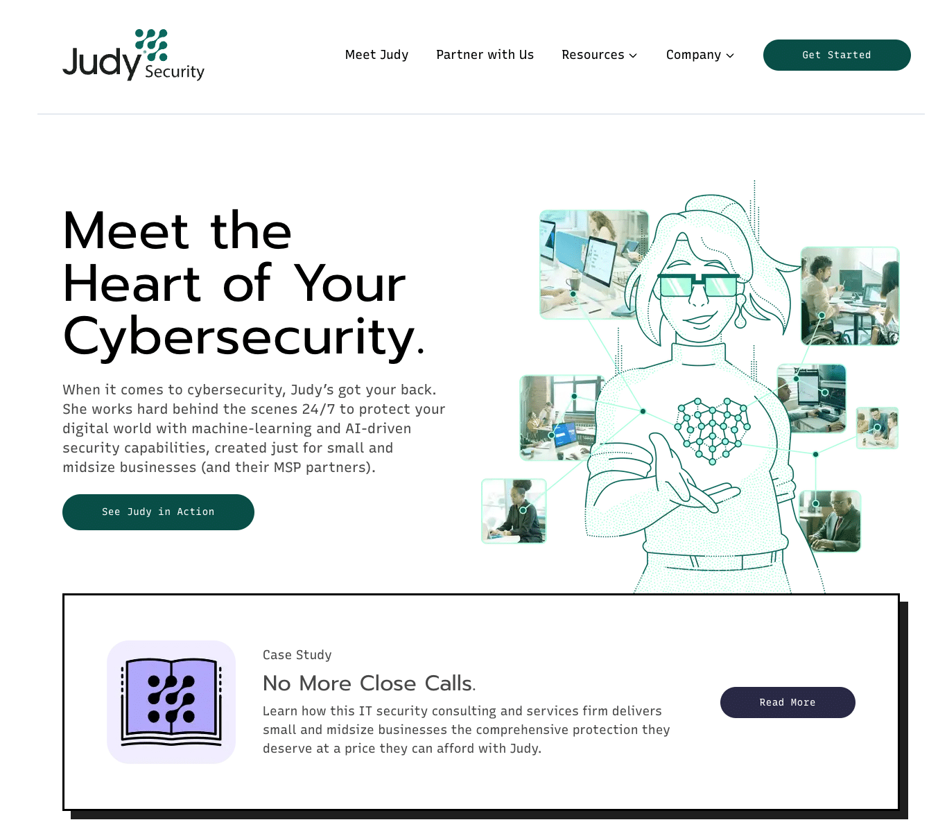
Judy Security leverages AI and machine learning to provide small businesses with password and sign-on management and compliance mapping. Judy partners with MSPs, MSSPs, and resellers to protect their customers’ data while also training end-users on how to take advantage of the platform.
The 5 Dimensions
- Messaging: Judy Security has chosen a novel approach to selling its solution – through the humanization of an AI platform. They stand out with their distinctive style. While slightly wordy at times, the message is clear overall and matches their quirky but effective design.
- User journey: The navigation is simple, there are strong calls to action, and they feature customer evidence prominently. Our one complaint is that some design elements “feel” like they should be clickable but are not, which is confusing for the end user.
- Design: Judy Security stands out with very distinct stylistic choices. We caution their designers always to prioritize aligning their message with their graphic choices. Sometimes, the balance is not there, and the visuals distract from the message. We’ll reiterate that some design elements “feel” like they should be clickable but are not, which is confusing for the end user.
- SEO: Judy Security ranks for four keywords. Clearly, content must become a top priority if they want to see more traffic.
- Website Score: 89. SEO, accessibility, and performance are all very strong. The biggest area of opportunity is content or keyword building.
TL;DR What we like:
- A strong and distinctive design and brand identity. Their choices make them stand out from the crowd.
- Strong, clear calls to action.
- The case study is the second element on the page. This is a great way to show rather than tell.
- The navigation, like the site as a whole, is simple and clear.
TL;DR What we think can be improved:
- The design can draw attention to itself rather than the message at times.
- The blurb in the hero is not as clear or strong as it could be. Make it more concise.
5. Claroty
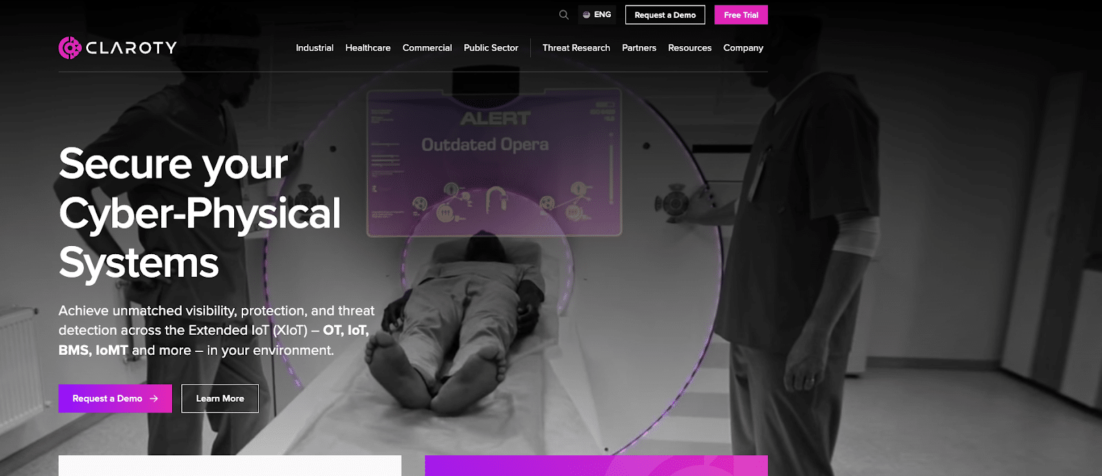
Claroty’s tagline is “Securing Cyber-Physical Systems Across the Extended Internet of Things (XIoT).” Their platform monitors devices across networks and detects vulnerabilities for better risk management.
The 5 Dimensions
- Messaging: Who they target and the problems they solve are apparent. However, the reliance on acronyms and initials tips them over into being difficult to understand at times. While they target industries prone to acronym proliferation, we encourage every business to embrace simple language. We all sell to people, and people appreciate clarity.
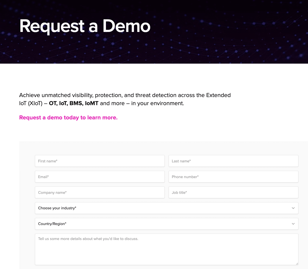
- User journey: The greatest opportunity for Calroty to improve its user experience is to offer alternatives to form fills when someone requests a demo or free trial. We recommend exploring guided tours or product feature videos as an alternative to forcing someone to interact with a salesperson. A first-time visitor will be annoyed by a form. They’re trying to discover whether the product will solve their problem, and this feels pushy. We also see weak calls to action as a barrier for some users. “Learn more” isn’t very descriptive and would be more effective as a linked element rather than linked text.
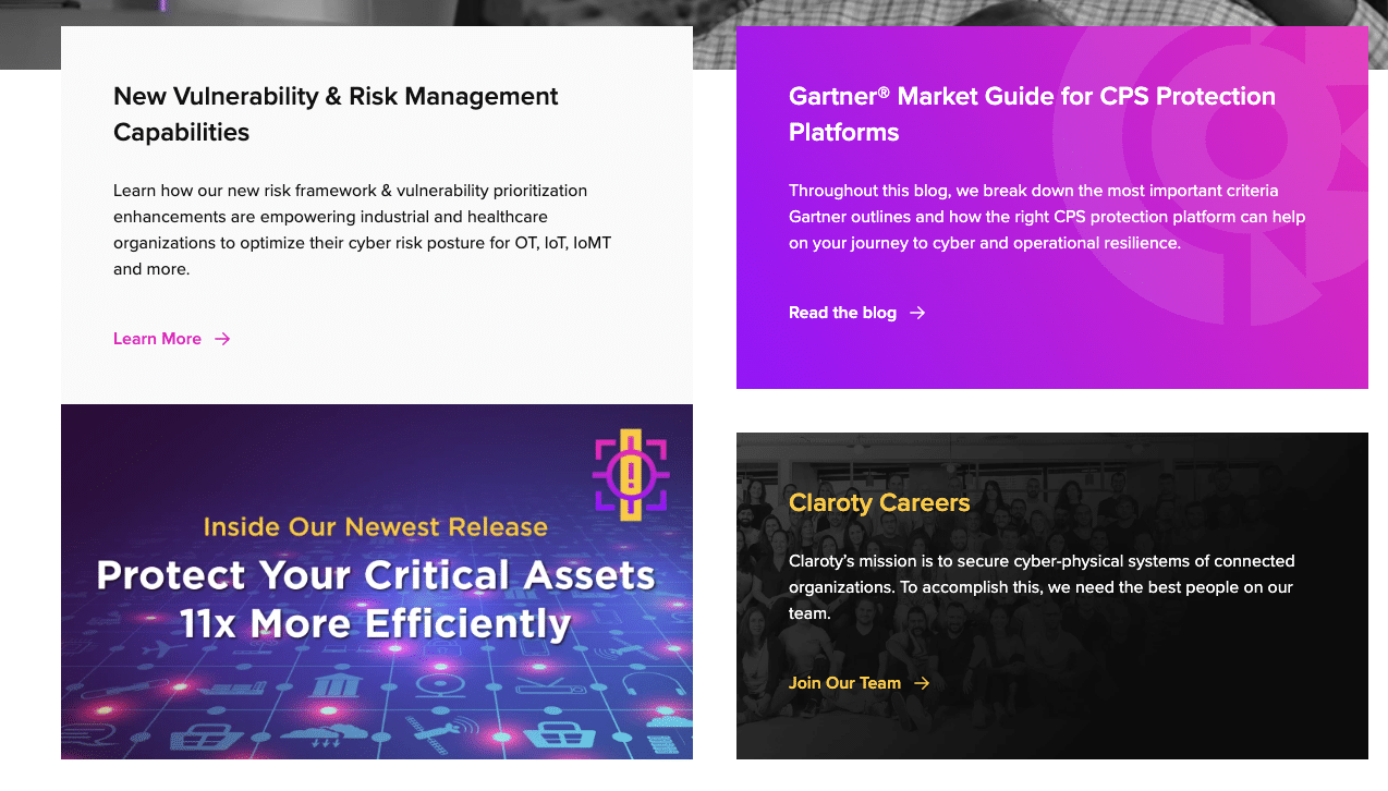
- Design: There are some very positive things to note about Claroty’s design. Their use of video in the background is compelling and visually pleasing. It doesn’t overwhelm the eye, which is a difficult balance to strike. Making the business sector the central organizing principle for navigation was a bold and effective choice in information architecture. This simplified and clarified site structure enormously. We also see the four elements under the home page hero as a simple and effective way to refresh the site content. We question some of the content choices in terms of priority (why is the research team featured before product and use cases?) and reiterate that the CTAs need work.
- SEO: Claroty ranks for 340 keywords.
- Page Load Score: 83. Adherence to best practices for design and web infrastructure are the biggest areas of opportunity.
TL;DR What we like:
- Eye-catching and effective use of video background in the hero without overwhelming the page. A difficult balance to achieve!
- Making business sector the central organizing principle for navigation is a bold and effective choice in information architecture. It simplified and clarified site structure enormously.
- Four featured content panels underneath the hero allow for simple updates to the homepage to keep it fresh.
TL;DR What we think can be improved:
- Request a Demo and Free Trial CTAs both take users to lead forms. This will annoy visitors. In today’s market, Free Trial should mean, “I can try out the platform now – without talking to sales.”
- All the elements after the hero have weak CTAs, both visually and in wording. “Learn more” links are just not effective. Make the whole element clickable and make the wording pop.
- The Research Team is too high on the homepage. The product and use case sections should be prioritized above it.
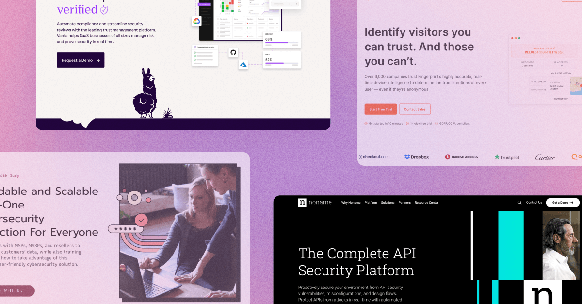
6. Noname
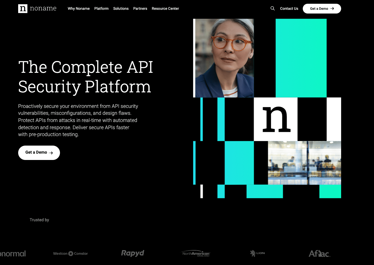
Noname is an API security platform that monitors your connections for design flaws, misconfigurations, and vulnerabilities.
The 5 Dimensions
- Messaging: Noname uses a no-nonsense approach to their messaging that we appreciate. While there are industry-specific initials and acronyms, they are used in the appropriate context. Plain English is used to explain what they do, who they target, and how they solve the problem.
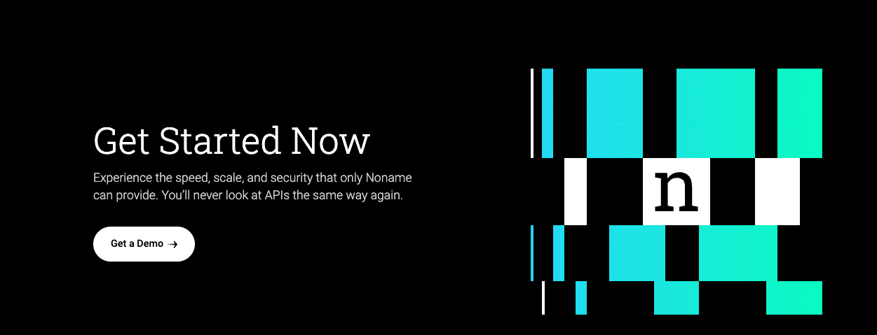
- User journey: The overall design and simple language lends itself to a straightforward user journey. The navigation is elegant, the CTAs are clear and sparing, and we appreciate their artful balance of content and streamlined design.
- Design: Noname’s design choices were powerful, and we only found a few opportunities for improvement. We caution the designer only to use animation and graphics when it serves a purpose. Sometimes, elements seem clickable but end up being a distraction instead.
- SEO: Noname ranks for 402 keywords.
- Page Load Score: 74. Noname should prioritize SEO error correction and accessibility to improve their ranking.
TL;DR What we like:
- A very clean, elegant, and polished layout with strong use of typeface and negative space. These choices lend gravitas and style to the brand.
- CTAs are minimal and powerful. They maintain a very strong focus on a few high-value actions, which means better conversion rates.
- Noname fits a lot of content onto the homepage without it feeling cluttered. Elegant tabbed blocks were key.
TL;DR What we think can be improved:
- The Platform Capabilities animation is very pretty but feels like it should be interactive and is not. Design for design’s sake is usually not a good idea.
- The screenshot of the platform doesn’t really “pay” for the space it uses. The page could move straight to the solutions and be shorter and more effective. The screenshot could live elsewhere.
7. Sumo Logic
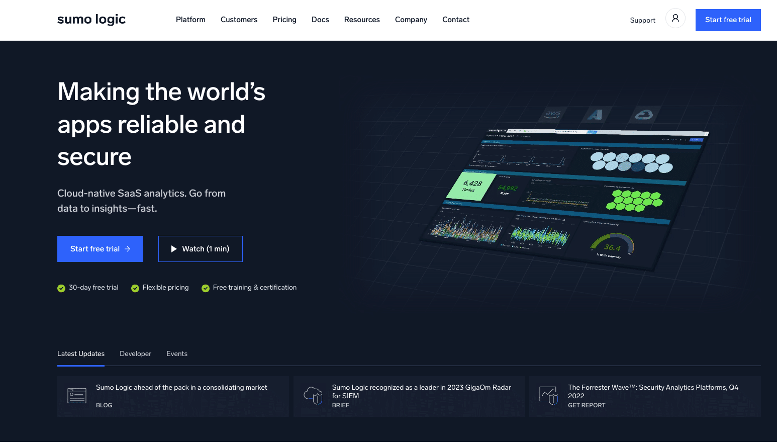
Their tagline is “Sumo Logic empowers the people who power modern, digital business through its Continuous Intelligence Platform™ to help practitioners and developers deliver reliable and secure cloud-native applications.” Sumo Logic empowers businesses through analytics spanning infrastructure monitoring, end user monitoring, application observation, and more.
The 5 Dimensions
- Messaging: Sumo Logic effectively combines design elements with straightforward text to make highly technical features understandable. We admired the short page length (a big plus, particularly in SaaS!), effective heroes, and clear “how it works” explanations. We want to see more user-centric storytelling to create a more compelling experience.
- User journey: The clear CTAs and simple topline navigation options are helpful, although the multi-click navigation is a bit clunky. We also suggest tapping into user pain points and using those problems to tell a stronger story that excites end users. This could be effectively done using case studies, testimonials, and return on investment statistics.
- Design: The biggest win in terms of design was Sumo Logic’s excellent execution of the “How It Works” section. As a whole, we found the design safe. Risk-taking isn’t always a good thing – particularly when design features don’t add value – but some of the companies on this list took risks that paid off. More visual cues could make Sumo Logic more memorable. The homepage, including the hero video, relies too much on screenshots from the application itself. These take up a lot of room and don’t add much value. You don’t sell a car by showing people pictures of the speedometer – use the space to tell (and sell) the company’s story.
- SEO: Noname ranks for 3,685 keywords, which is expected for such an established brand. We recommend prioritizing updating and refining existing content republishing instead of adding net new content.
- Page Load Score: 27. Page speed is notably low and should be addressed immediately.
TL;DR What we like:
- Effective hero section with a single strong CTR backed up by trust signals.
- “How it works” sections effectively condense complex features into understandable chunks.
- Remarkably short for a SaaS homepage – which is a positive!
TL;DR What we think can be improved:
- The homepage, including the hero video, relies too much on screenshots from the application itself. These take up a lot of room and don’t add much value. You don’t sell a car by showing people pictures of the speedometer or a smartphone by showing screenshots of the settings screen. Use that space to tell (and sell) the company’s story.
- The design feels a bit flat, tame, and generic. It needs some depth and some flair to make it memorable and impressive.
8. Drata
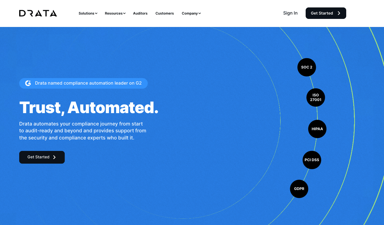
Drata is a framework compliance monitoring solution that enables companies to collect the information necessary to pass an audit for SOC 2, ISO 27001, HIPAA, GDPR, and many more.
The 5 Dimensions
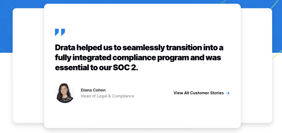
- Messaging: Drata’s messaging demonstrates a familiarity with their key personas. They emphasize solutions to real concerns and use plain English to explain what they do. We appreciate how they weave in customer evidence throughout the website very effectively.
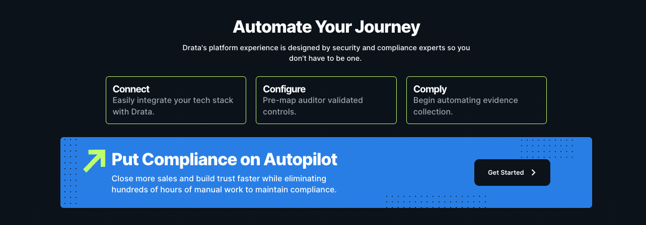
- User journey: The clear CTAs, effective mouseovers, and clean, bold design choices streamline the user journey. Users may experience friction trying to navigate the “Solutions” section of the navigation bar, and the “Automate Your Journey” section doesn’t deliver as expected. Showing this section some love could pay off for Drata.
- Design: Drata’s design is simple and bold without boring the user visually. Design touches and mouseovers add elements that make the page come alive and make Drata’s user experience memorable. We would recommend splitting the “Solutions” navigation into “Platform” and “Framework” to make it less cramped and confusing. We also recommend paying more attention to the “Automate Your Journey” section to realize its full potential.
- SEO: Drata ranks for a respectable 918 keywords.
- Page Load Score: 24. Page load time across devices and screen dimensions should be prioritized. There are some significant performance issues impacting this score.
TL;DR What we like:
- Strong, clean, and bold design with an excellent hero section.
- Little design touches and mouse overs make the page come alive.
- Strong, clear CTAs throughout the page.
- Emphasis on customer stories is excellent.
TL;DR What we think can be improved:
- Solutions section of top navigation is unnecessarily cramped – could split it into two nav sections (Platform and Frameworks) as it is in the footer.
- The “Automate Your Journey” element in the footer feels a little tacked on, and feels like it should be clickable. The content is strong and should be moved higher up the page and given some love.
9. Egnyte
Egnyte is a content platform that prioritizes security and compliance. It integrates with many applications and enables end users to collaborate in a secure environment.
The 5 Dimensions
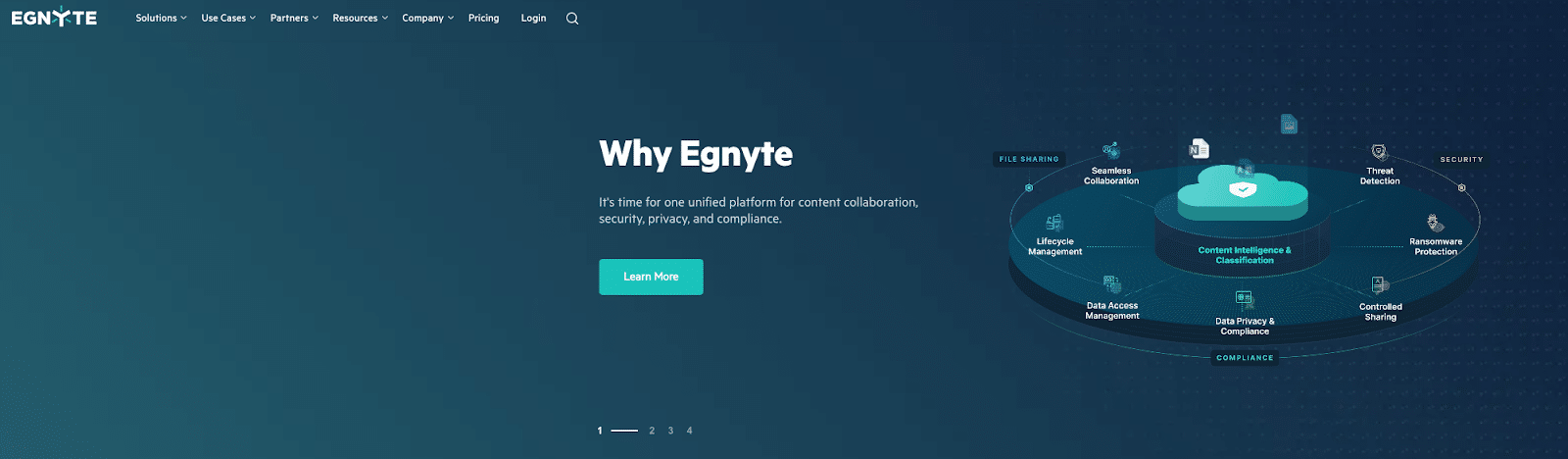
- Messaging: Egnyte has compelling use cases and customer stories and embraces a bold design aesthetic. However, we do find the carousel header confusing and product descriptions unclear. There is excellent information buried on the “Why Egnyte” page that would benefit end users front-and-center on the home page in place of some of the more confusing elements that aren’t adding a lot of value today. The “featured solutions” section is confusing. How were they chosen? Without a frame of reference, it just feels like “news” instead of useful product info.
- User journey: “Explore the Product” is a powerful CTA that should be featured more prominently. The carousel header on the homepage also confuses users immediately, throwing them off the ideal journey. We recommend rethinking product feature messaging, focusing on user stories, and refining the approach to “Featured Solutions.” Again, moving language from “Why Egnyte” to the home page will help end users understand what Egnyte does.
- Design: Egnyte’s brand identity and site design are distinctive and mature, which adds credibility to the company. Carousel-style hero sections generally sacrifice impact for flexibility; unfortunately, we can see that clearly here. It’s better to double down on a single, powerful message than to hedge your bets with three or four weaker ones.
- SEO: Egnyte ranks for 2,643 keywords.
- Page Load Score: 47. Page load time across devices and screen dimensions should be prioritized
. There are some notable performance issues impacting this score.
TL;DR What we like:
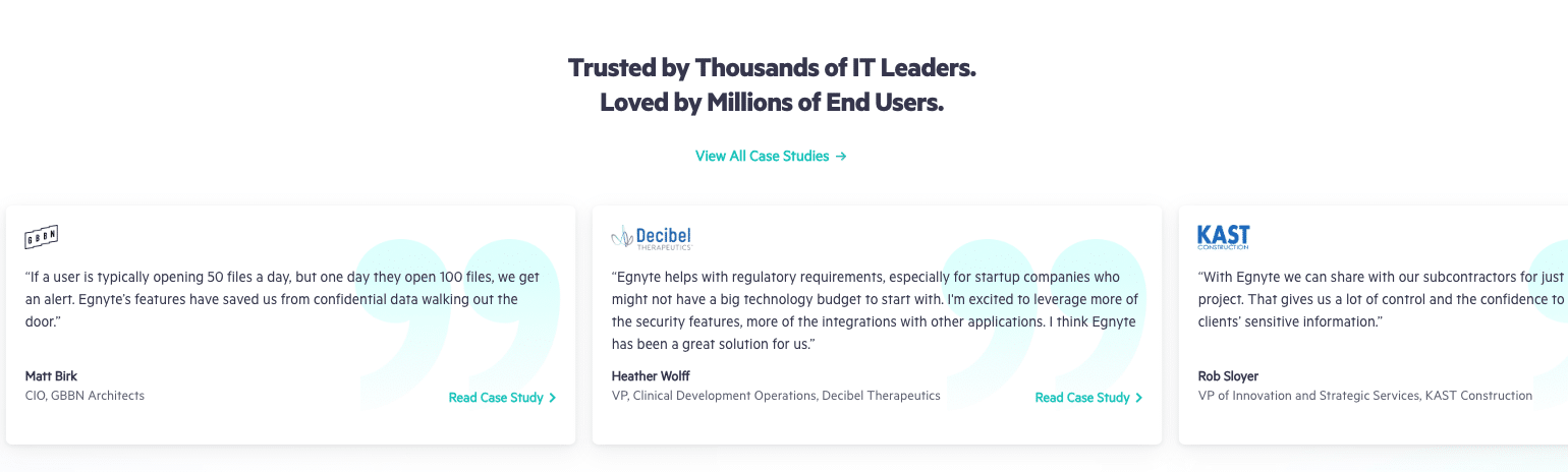
- The brand identity and site design are distinctive and mature, which adds credibility to the company.
- In-depth case studies are linked from the homepage. This is a great way to show instead of tell.
- “Explore the Product” is a strong CTA, although it should be placed higher on the page.
TL;DR What we think can be improved:
- Carousel-style hero sections generally sacrifice impact for flexibility; unfortunately, we can see that clearly here. It’s better to double down on a single, powerful message than to hedge your bets with three or four weaker ones.
- The “featured solutions” section is confusing. How were they chosen? Without a frame of reference, it just feels like “news” instead of useful product info.
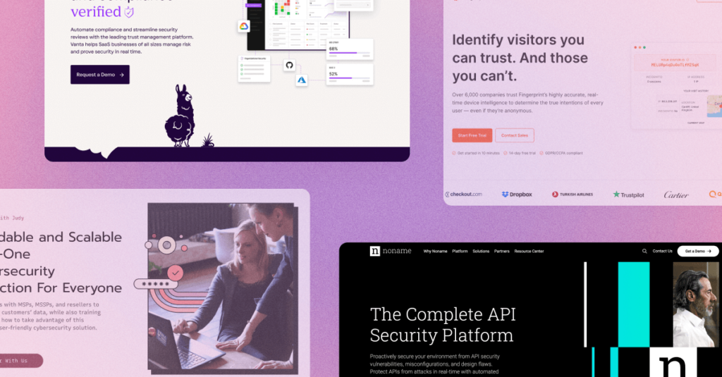
10. Vanta
Vanta is a compliance monitoring and automation platform that helps SaaS companies prepare for key framework compliance audits like SOC 2, HIPAA, ISO 27001, and more.
The 5 Dimensions
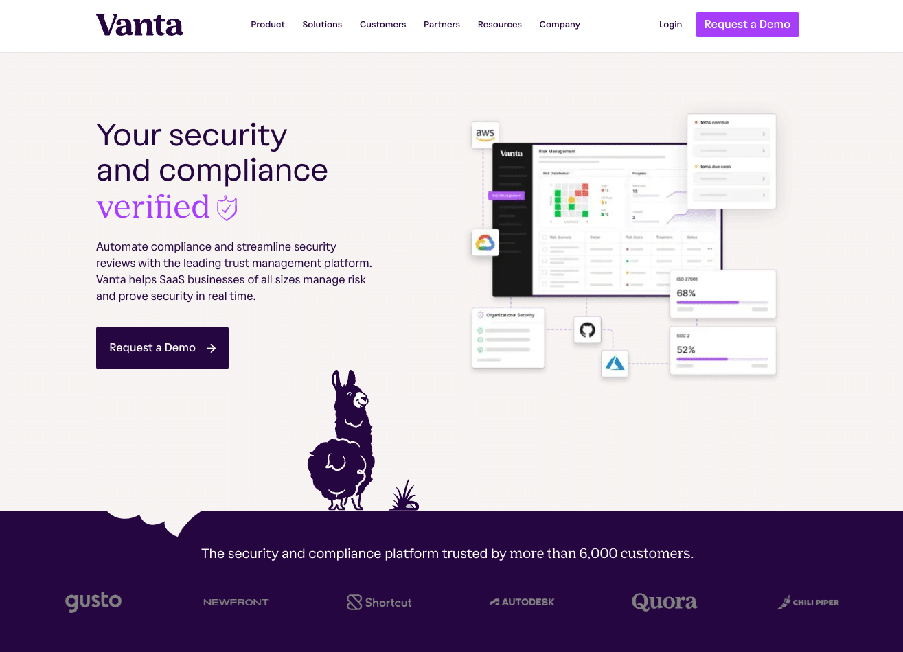
- Messaging: Vanta’s brand is distinctive and strong. Quirky yet effective design choices kept us engaged and charmed as we navigated the site. The llama is a compelling character that follows us on a journey, and the website messaging helps tell the story in coordination with the design.
- User journey: Vanta uses clear CTAs, clean navigation, and wise design choices to encourage buyers along the journey. We recommend revisiting the CTAs that are lower on each page. We saw the word “explore” quite a bit without any context that would compel us to do so. Many elements seem clickable and are not, which confuses the end user.
- Design: Vanta’s design choices were among the strongest in this category. Their website was quirky and beautifully designed. The aesthetic is perfectly polished and very distinctive and memorable. It really elevates the entire brand to something special.
- SEO: Vanta ranks for 1,210 keywords.
- Page Load Score: 77. Page load time across devices and screen dimensions should be prioritized but is not urgent.
TL;DR What we like:
- A quirky and beautifully crafted design. The aesthetic is perfectly polished and very distinctive and memorable. It really elevates the entire brand to something special.
- Very strong, clear, and consistent CTAs – particularly in the hero and navigation.

- The whole page is full of delightful touches that keep you scrolling and charmed. We respect the power of an adorable llama.
TL;DR What we think can be improved:
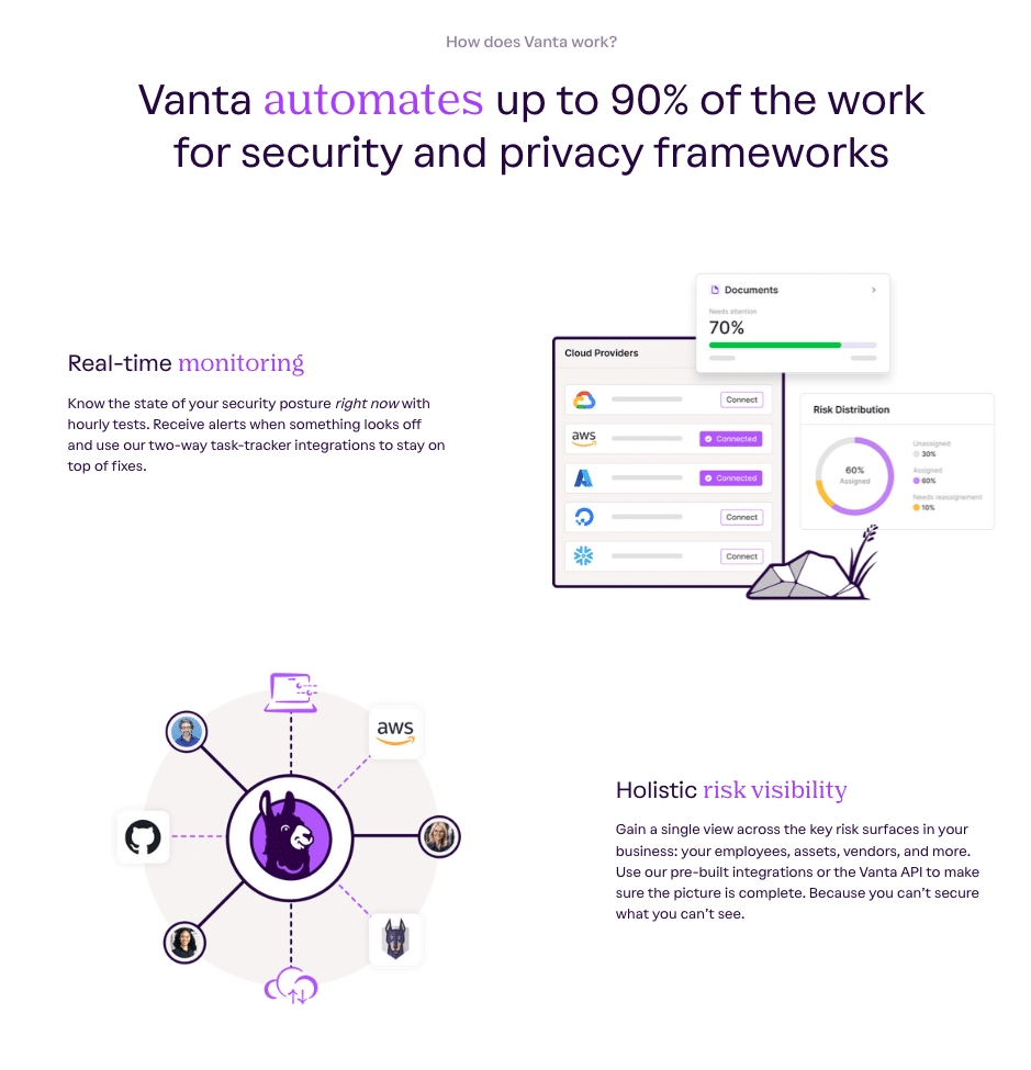
- Many elements that feel like they should be clickable and are not, which can cut short or confuse the buyer journey. For example, the “How Does Vanta Work” section.
- CTAs lower down the page could be stronger and more distinctive. We got tired of seeing the word “Explore” over and over.
Our key takeaways from evaluating cybersecurity websites
There are endless possibilities for creating an appealing and converting homepage, but the fundamentals will always hold true:
- Identify your ideal customers.
- Know what matters to them.
- Showcase your unique selling points in a manner that demands their attention.
There’s an obvious difference between elegant and effective design and distracting visuals if you know what to look for. Ditch the buzzwords and jargon. Don’t prioritize visual aesthetics when it confuses the end user or obscures the message.
Ultimately, your website needs to compel your target audience to engage. To do this, focus on why your customers should care about your product, demonstrate a deep understanding of their pain points, show them an elegant solution, and then always back it up with plenty of customer evidence.
If you’re looking to transform your homepage into a revenue-generating one, let’s talk.