Website Strategy: Information Architecture Part 1
The Airfleet Website Redesign Series
If you want to read the reasons and the kick off of our new website, this is how the redesign started.
Airfleet Website Redesign: Phase 1
Information architecture is perhaps one of the most underrated aspects of website design, but it’s vital to remember that content prioritization, taxonomy, and navigation can make or break your user experience. Skipping information architecture is like baking a cake without a recipe. You might end up with something recognizable, but you’ll likely end up with a mess.
Our Airfleet website redesign began with the information architecture phase. At the center of our information architecture development process was a mapping exercise that illustrates the expected or desired buyer journey for each core page.
We understand that most visits won’t immediately attract in-market B2B digital marketers looking for a website. Our goal is to meet each visitor where they are in the buyer journey and provide the right information at the right time.
This article is a great example! If we provide useful examples and enough details to help marketers considering a website redesign, they may think of us for future content needs. The more they use our content, the more likely they will recommend our website and remember our brand.
In that spirit 🙂we’ll share some major pillars of the information architecture phase and divulge the rest as our project progresses.
What We Needed Before Beginning This Phase
Before diving into an information architecture project, you must thoroughly understand your key personas. You need to know their motivations or the problems they want to solve that your solution perfectly addresses.
In our case, our key personas are relatively similar. We’re selling to marketing managers, directors of marketing, growth marketing managers, and demand generation marketing managers. We’re also targeting CMOs and VP-level executive marketers.
There are some differences in what problem they’re looking to solve and how.
Marketing managers seek to solve specific problems in their funnel. They know what’s wrong with their website and are looking for a partner to help them.
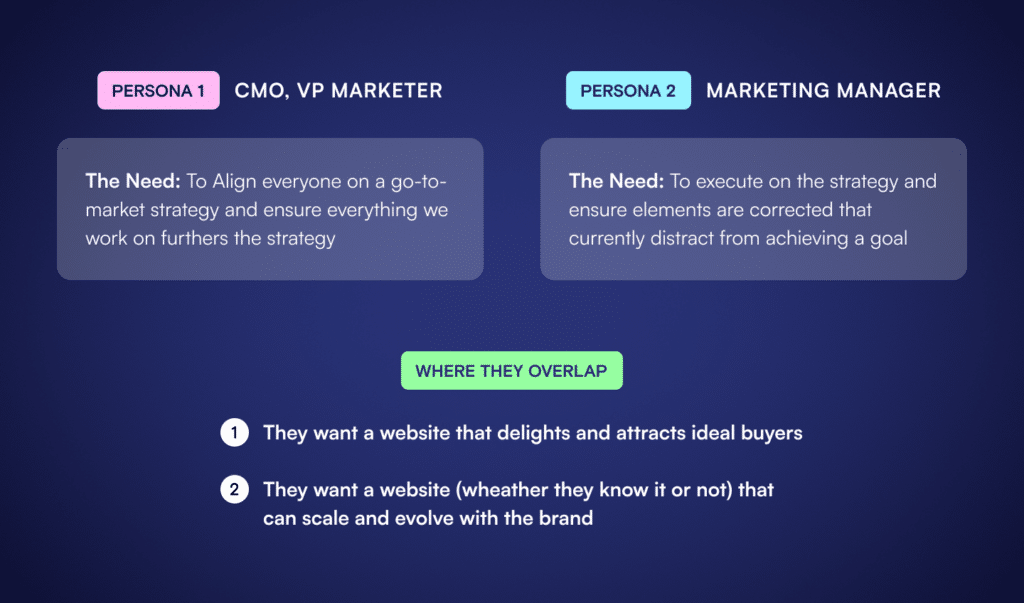
On the other hand, VPs and CMOs tend to focus more on strategy, brand, and other higher-level concepts. They may not know or care about the nitty-gritty details of the website. They’re looking for someone who can translate their high-level goals into a tactical list of things to change or complete.
When it came to understanding the needs, we found that there were primary needs and underlying or unknown needs. These included:
- To create an informative and compelling website, which means finding a developer or agency to redesign or build their new site.
- Long-term evolution: they need a website that will scale and adapt to the market and tool changes they make over the years.
You’ll also need to understand your brand and product offering architecture. At a minimum, your product or services must be well defined, competitors must be identified, and, more importantly, your team needs to precisely understand what differentiates your product or service from the alternative vendor.
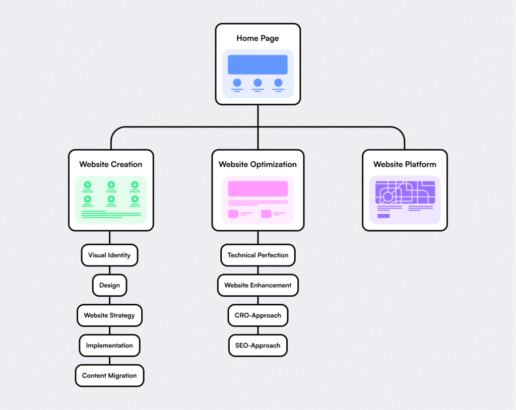
Creating new websites versus improving or optimizing an existing website are very different services, and different tools may be involved. Creating a new website gives us some flexibility to influence the tools that are used. Optimizing an existing website may mean we’re stuck with less-than-ideal tools. We decided to differentiate these two items as Create (a new website) and Optimize (an existing website).
To satisfy the underlying need to create a website that can accommodate years of change (messaging, branding, services, etc.), we created an Airfleet Platform product.
We took the data generated by our research and plugged that into our handy-dandy information architecture survey to get a starting point.
The Page Manifest
Before you perform a content audit and well before you design a page hierarchy or assign labels, we create a list of the types of pages we need. This isn’t a sitemap. This list aims to figure out the function we need core pages to perform.
Here are a few page types from our project and why we chose them:
- Solution Pages: A page that will highlight services or products and convince potential buyers we’re the best choice. These pages will also have subpages to help us explain the variations within each of these core offerings.
- Tech & Partners: These pages will serve multiple purposes, educating our visitors about best practices and convincing them of our expertise. Our experience working with hundreds of technology partners and platforms makes us unique as a service provider. This gives us an edge in maximizing our client’s tech stack.
By defining what we need our pages to do first, we’re thinking about what our visitors expect and need versus trying to shoehorn our existing content into a new look and feel.
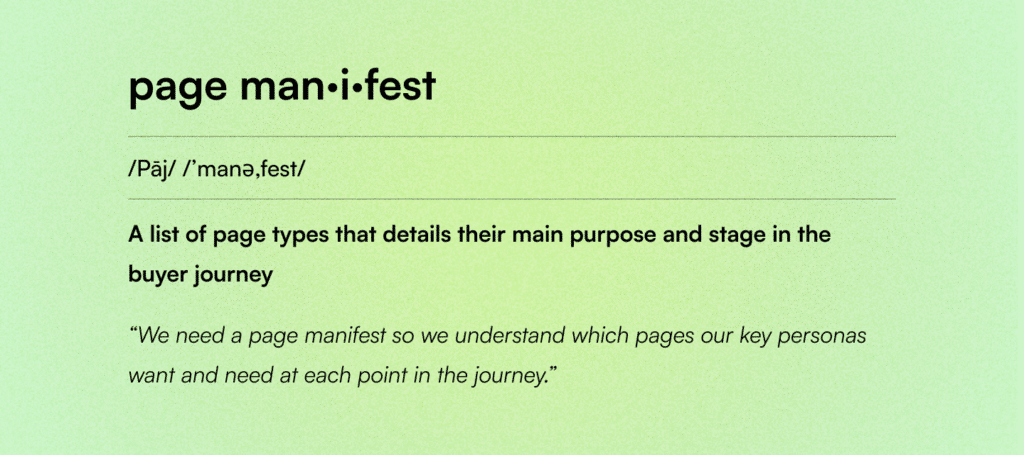
After we know the page types and their purpose, we can start listing which pages we need to build under each key type. For example:
- Solution Pages: (purpose = convince)
- Create for new website builds
- Use Cases
- Optimize for overhauls of existing websites
- Use Cases
- Platform for our suite of web tools that allow marketers to refresh key aspects of their website and challenge the current construct of a CMS
- Integrations
- Why Challenge the CMS?
- Use Cases
- Create for new website builds
- Tech & Partners: (purpose = inform, educate, convince)
- These pages will serve as a demonstration of our skill and a low-funnel SEO play:
- We list the 300+ platforms we have experience with.
- We created a reusable template to explain the tech, the implementation, and how Airfleet can help with that technology (plus any case studies or examples).
- We’ll optimize for feature snippets using terms like “Best practices for VWO implementations” to attract relevant traffic that could potentially turn into a lead.
- These pages will serve as a demonstration of our skill and a low-funnel SEO play:
Information Hierarchy
Once we knew what kind of pages our ideal customers needed to understand how great we were to work with, we began documenting the required information on each page. Instead of checking off the copy on pages we already had, we needed to sketch out which information was relevant to a potential buyer and how important that content was to their decision-making.
This exercise helped our team prioritize each page’s copy and calls to action to align with the ideal buyer journey.
What helped us think through the process was mapping out our ideal audience (core personas) and re-clarifying the following:
- Role: For example, Digital Marketer, CMO, or VP/Director of Growth.
- Need(s): For example: “I need a revenue-generating website that’s crystal clear and beautiful, AND I need it to adapt to tool and strategy changes.”
- Initiative or Inciting Incident: For example, “Existing contract with the previous designer is ending in 6 months, and we want off of our current CMS” or “I have inherited a website that’s untenable for our brand.”
We also charted out the type of information a persona would need to make a decision. Some examples from our drawing board include:
- Educate: Material for an audience that doesn’t understand a topic or problem but wants to learn about it. In this case, details about websites for B2B that aren’t common knowledge amongst marketing leadership.
- Inform: Material that builds knowledge about related topics or problems for people with a baseline familiarity with the topic or issue. In this case, detailed write-ups about trends and changes in website-related stuff.
- Convince: The audience is knowledgeable about the topic but needs to figure out why they should consider your solution. In this case, we specialize in orchestrating buyer journeys for B2B tech and have a full suite of services.
- Compare: The audience is convinced of the solution’s value but wants to understand the differences and similarities between offerings or competitors. This could be about why the technology we choose is better or why our services are better.
- Promote / Sell: The audience understands your solution and actively considers purchasing. We think of this as limited-time offers, product bundles, and events that showcase our know-how.
Not all pages will contain information from all categories. Well-designed information architecture reduces the need for redundant information. For example, we leave the informing to blogs and events and focus on educating or convincing on many key pages.
Once we know the motivations and needs of our personas and the types of information we need to offer, we can design appropriate calls-to-action (CTA).
Common examples of CTAs include:
- Book a Demo – This makes more sense for us as a button that pops up a chat prompt with a calendar booking function.
- Web Chat Popup: Converse with an automated bot or a sales or customer support representation via an on-site chat tool.
- Download Now: We have guides, workbooks, checklists, and other materials for people looking to build or optimize their websites.
- Watch a Video: Encourages increased engagement by offering embedded video content. These could be product demos, recorded webinars, educational content, an animated explainer, etc.
These pieces flow together to form an engaging page. We start with the purpose and ideal buyer journey associated with the page, analyze the buyer’s needs, and present them with the correct information and compelling CTA. We’d call it magic, but it’s just following best practices.
As a result of this homework, we landed on a solid sitemap – more about the full process in our information architecture part 2 article.
