


Website Strategy: Information Architecture Part 2
The Airfleet Website Redesign Series
If you haven’t read the previous article, start with the Information Architecture Part 1.
Airfleet Website Redesign: Phase 2
In our prior article in this series, we covered what kind of research must be done in order to complete an information architecture project, how to create a page manifest, and how we thought through our information hierarchy.
This time, we’ll get into the really nerdy stuff 🤓
Of course we’ll go through our new navigational schema, taxonomy, and URL structure, but they aren’t the stars of the show.
Don’t get us wrong. These things are important. But it’s important to keep in mind that throughout these steps, we obsessed over the words we chose to represent various navigation elements, CTAs, and what we do as a company.
We’ve seen the difference the right words can make in the data, so we really thought long and hard about what to call each part of our navigation, how to name what we offer, and how to talk about what we do.
The data will be the judge of whether we’re on the right track or need to update things in the future, but for now, let’s talk through our process.
Building the Airfleet taxonomy
Now that we’ve created a page manifest, we can develop the levels of information we need and how that information should be grouped.
Think of this like classifying organisms in science class. We want to group bears together, rabbits in a different group, and then bees in a different branch. If we put all those things in one bundle, it gets weird (and messy!) real fast. The page purposes we set in our manifest help a lot here – pages designed to convince users tend to be in clusters, while those that educate users tend to belong together. If we group the kinds of website content in the right bundles, it makes way more sense to our end users. It also makes structuring our navigation (the next phase) a lot more sane and straightforward.
What is website taxonomy?
A website taxonomy is how we classify different kinds of content using groups and levels. The intent of taxonomy is to help visitors quickly find the information they need.
A Level is hierarchical as well as recursive. Higher level groups contain related lower level groups. Higher level pages are, as a rule, both greater in importance and will be featured more prominently in navigation and signposting.
Note: We aim to have four or fewer levels and try to keep things as simple as possible.
A Group is a collection of pages with a similar purpose and/or audience. The functional purpose of groups is to make user journeys as smooth as possible.
Our goal with taxonomy is to make it obvious where someone “is” on our website and what to do next.
For Airfleet, we decided to tackle the project in two distinct phases, so we’re not listing the complete taxonomy here, but it’s a starting point.
For Phase 1, we mapped out the levels like this:
| Level 1 | Level 2 | Level 3 | Level 4 |
|---|---|---|---|
| Home Page | Services Overview | Service Detail/Feature Set | Proof Points, Testimonials, Use Cases, Feature Specifics |
| Partnerships & Technologies | Partner or Technology Showcase Page | Perhaps use cases/case studies? | |
| Resources | Blog Events Special resources Newsletter | Collection page: Blog Collection page: Event Collection page: Other Collection page: News | |
| About Us | Who we are Why work with us vs. someone else Vision & Mission Careers | Open positions FAQ Submit CV |
In our sitemap, it looks like this (this is just a sample set because it gets really detailed really fast):
| Level 1 | Level 2 | Level 3 | Level 4 |
|---|---|---|---|
| Home Page | <Service Overview> New Website (Create) | <Service Feature> Visual Identity | <Technical Specifics +> Logo Creation Visual Concept Brand Book |
| <Service Feature> Design | <Service Specifics +> Design System Responsive Design Illustration & Animations | ||
| <Service Feature> Website Strategy | <Service Specifics +> Information Architecture User Journey Wireframes URL Structure Navigation | ||
| <Service Feature> Implementation | <Technical Specifics +> WordPress Website Infrastructure Security Website Development | ||
| <Service Feature> Content Migration | <Technical Specifics +> Mapping Automated Migration URL Redirects | ||
| About Airfleet | Company Vision & Mission Why Airfleet Careers | <Career Details> Open positions FAQ Submit CV |
Examples of Groups are:
| Group | Purpose | Type of Pages |
|---|---|---|
| Create Pages | Pages focused on clients who want a brand new website from scratch | – “Create” Solution Overview – “Create” High-Level Feature with feature details embedded widgets + anchors – “Create” Use Case Pages |
| Optimize Pages | Pages focused on marketers who know their site isn’t great and want to fix it | – “Optimize” Solution Overview – “Optimize” High-Level Feature with feature details embedded widgets + anchors – Optimize Use Case Pages |
| Platform Pages | Digital-savvy marketers who want a DIY solution that doesn’t suck for B2B | – “Platform” Solution Overview – “Platform” High-Level Feature with feature details embedded widgets + anchors – “Platform” Use Case Pages |
| Technologies/Partners | Detailed pages that combine useful information in an SEO-friendly format | – “Technologies/Partners” overview – “Technology/Partners” Detail Pages |
| Company | Pages that either show off how great we are to work with (or for) or how we’re better than a major competitive group | – About Us – Career Overview Page – Career Detail Pages |
So if we were to look at this from the standpoint of a B2B marketer looking for a new website, we’d have different starting points in their journey that all lead to an outcome:
Creating Airfleet’s navigational schema
Now that we have our groups and their taxonomy, we can construct our navigation schema. This doesn’t concern design, functionality, or placement from a data storage standpoint (at least not anymore – these things used to matter more!).
When building our navigational schema, we focused on four things:
- What are our main navigation headings? These are the labels on our navigation bar.
- What are our sub-headings? What shows up if we hover over a navigation bar item?
- What CTAs do we need on every page?
- What do our lobby pages contain? (A simple list of page types or specific pages.)
These are the rules we stand by when working with clients and for our own website:
- Never mix groups – Pages from one part of the site do not belong with pages from another. If you have a strong desire to mix, it suggests your taxonomy is not correct or adequate.
- Never repeat – No two navigational headings should ever lead to the same page. It is fundamentally confusing and feels like an error
- Less is more – Shorter, simpler headings are always better. If you need more than three words in a heading, it’s time to stare at a thesaurus and find a better phrase or word.
- Design with repeat visitors in mind – Many B2B sites convert a potential prospect to a lead after repeated site visits. You must design the navigation to keep finding a page someone has already seen in mind just as much as what the site is about for first time visitors.
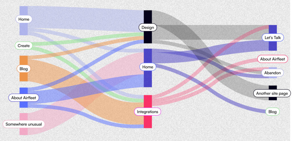
To be completely honest, the navigational schema exercises led to the most debate on our team. Particularly around headings. That’s why it’s going to be important for us to collect feedback and monitor how people are navigating through the site using path analytics. For now, at least, this is where we landed with the main navigation:
| Main Header | Sub-Header | Menu CTAs |
|---|---|---|
| Create | Visual Identity Information Architecture Website Design Development Content Migration | Explore the process |
| Optimize | Technical Perfection Website Enhancement Conversion Rate Optimization Search Engine Optimization | Optimize overview |
| Platform | Features CMS Integrations Optimization Add-Ons | N/A (TBD) |
| Learn | Blog Events | Featured Posts |
| Careers* |
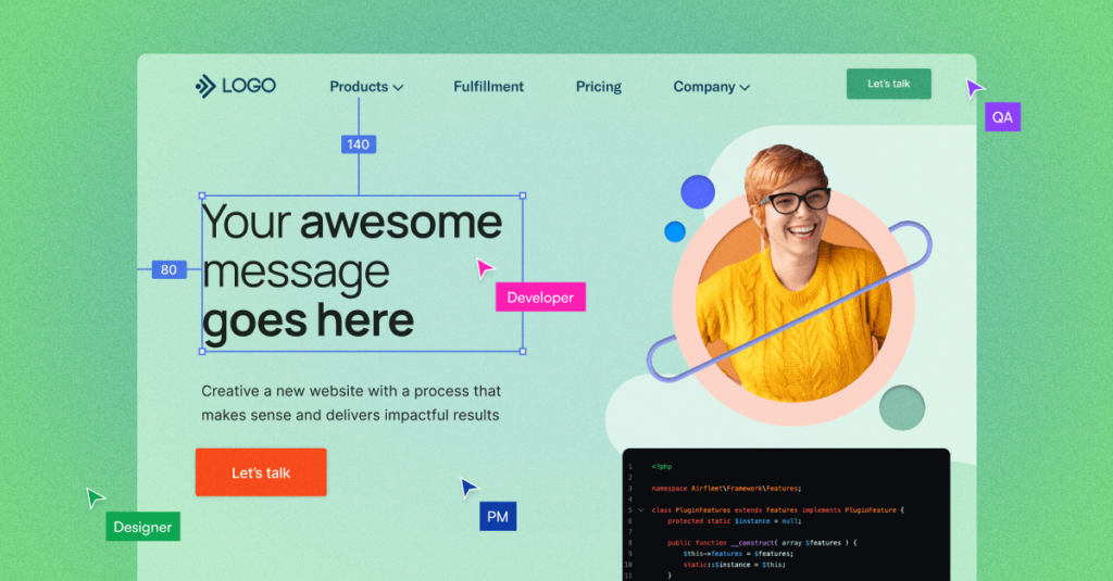
Now it’s time to decide on our CTAs based on what we want the visitor to do next. There will be CTAs throughout the website, so let’s just focus on the home page.
Global CTAs like the call to action in the navigation bar have to be clear and concise. “Contact Us” is embraced by much of B2B, but that’s a bit pedestrian for our tastes. We deliver a professional experience, but you’re going to get our opinion. We’ve been building websites long enough to have plenty! That’s why we went with “Let’s talk.” We want our first interaction to be a conversation. We’re happy to talk about best practices if you’d like – but we really want to understand if we’re both a fit for one another.
Other CTAs are structured by the journey the visitor is taking and where they are in the journey. For example, if they want to learn best practices, we hand-pick some of our favorite articles and give them the option to “See all resources.”
For our key solutions, we have different offers and CTAs that correspond with them.
For our Create (new website) solution, we offer a 90-day go-live timeline for new website customers*. *We’d be insane if we didn’t put some parameters around that offer. If you’ve been in business for 20 years and have thousands of pages of content or twenty business units, 90 days is not going to be enough. That’s why we say “See if you qualify.”
For our Optimize solution, it made the most sense to offer “Get an audit” as the next step. You need a solid evaluation of what’s good and what’s not. We need an opportunity to understand the scope of work we’re committing to.
Platform is our website platform for DIY marketers, and we know these digital experts will need to research every feature before they can commit to major change. That’s why we kept it simple with “Learn more about our Platform.”
Finally, we need to round out the page with a CTA that is for buyers but not so narrow that we’ll exclude people who have a specific solution in mind. “Book a meeting” is a classic because it’s fantastic. You know exactly what you’re committing to and what you get.
The logic behind URL structure
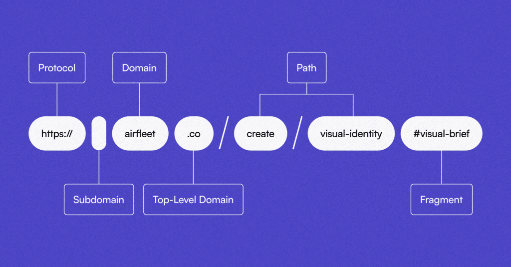
There are several parts to a URL string. We already had a domain we use since this is a redesign, but we did need to put some thought into the path. Here’s a very simplified illustration of the anatomy of a URL:
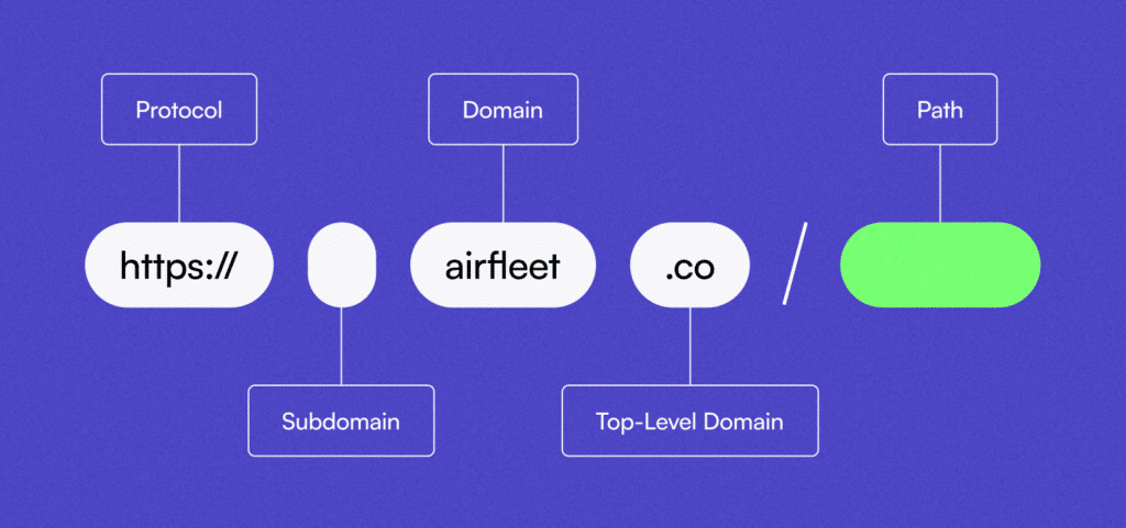
In addition to the above, you may see a port after the top-level domain, a fragment after the path (to indicate a special portion of content or a page), a query string, and, of course, the beloved UTM parameters for tracking purposes.
For us, our main URL string is the protocol (“https://”), the subdomain is blank for our main website, the main domain (“airfleet”), and the top level domain (“.co”).
In the past, the path was driven by the folder structure or directory of storage buckets for a website. There was a purpose and physical component mapped to each branch. These days the path is more of a navigational construct (although with some platforms, you’re stuck with the CMS label for a collection of pages).
Because we have much more flexibility in how we can label pages, we tie them to the navigational schema. That way, people understand where they are on the website at all times. Here’s a good example of a few clicks into our navigation from our new website:
Between our Part 1 article and the steps outlined in this piece, you have a complete picture of what all goes into a typical information architecture phase. It’s a lot of work! But if done correctly, you’ll have a more streamlined buyer experience that helps visitors understand 1) what you do, 2) how it solves their problem, and 3) exactly where to go to get the information that’s appropriate for their stage in the buyer journey.
We hope you enjoy this look behind the scenes and welcome any feedback!